1. In what ways does your media product use, develop or challenge forms and conventions of real media products?
PRE-PRODUCTION: ANALYSIS OF EXISTING SHORT FILMS
As part of the Pre-Production, Research and Planning process, we had to individually watch 4 different short films and analyse them in order to identify and understand the typical features of a short film. I came across several different narratives which incorporated different techniques and features which allowed me to gather a wide range of different ideas. But in order to successfully produce a realistic short film, it's important to understand the literal definition of what a short film is; a short film is an original motion picture that has a running time of 40 minutes or less, including all credits. They are often made by independent filmmakers for non profit, either with a low budget or no budget at all. They are usually funded by film grants, non profit organizations, sponsor, or personal funds. Short films are generally used by filmmakers to gain experience and/or prove their talent in order to gain funding for future films from private investors, entertainment companies, or film studios. Typical features of short films include:
- 5-10 minutes in length
- Only a few main characters, rarely any secondary characters due to the short length of the film enabling the audience from getting to know them
- Released by independent film companies
- Most popular form of short films are animation or live action
- They are usually realistic
- They often provide a situation needing to be solved by the protagonist
- The actors are never big named actors due to the low budget
- One protagonist throughout the whole plot
- Voiceover and/or narration are often used to deliver information to the audience quickly
I think as a group, we successfully took this definition into account and ensured that we considered what was expected.
The 4 short films I individually researched acted as a guideline for what we were asked to produce. They gave us a rough idea of what short films look like and what they consist of. By the 2nd analysis, I had already grasped a deep understanding of what's required in the making of a short film.
Short Film number 1: 'Gone Goodbye'
'Gone Goodbye' explored relationships and privacy in unusual and surprising ways.
It's a well told extended metaphor for the inner conflict faced by anyone who has chosen to leave a long term relationship
The short film began by fading into a tracking shot behind a car as it drove along the road, this was accompanied by sad and tragic non-diegetic music that sounded heart-breaking which indicated the Social Realism genre. This set up the Equilibrium stage in terms of Todorov's model as everything seemed normal and undisturbed. Neale's theory of Repetition and Altman's theory of Semantic and Syntactic codes, caused us to expect to see a clear repetition of syntactic codes, such as realistic events that can be somewhat relatable in a Social Realism film.
A male voice over also accompanied the first shot slightly after the entrance of the sad non-diegetic music. The tone of the unknown narrator sounded sincere and meaningful and the first words being "Dear Catherine" suggested that he's reading out a letter. The voice over progressed on to talk about not wanting to be with the 'Catherine' character anymore as the man stateed blunty: "I'm leaving you". This reflected the Social Realism genre as it's something that happens regularly in life; breaking up with your loved one is a relatable issue and acts as a syntactic code in terms of Altman's theory as it reinforced the genre. The voice over also confirmed that it was a long term relationship as he said: "I should of left you years ago Catherine", this made the sadness of the short film more meaningful.
The shot became a long take as the camera progressed to a high angle as it eventually broke into a birds eye view of the car driving along the road, this was sustained for the majority of the opening. The birds eye view put the audience in a superior and spying position as it still wasn't made obvious who was driving the car. The lighting was fairly low-key which reflected the gloom within the voice over and it also created a dull atmosphere. The setting so far didn't change from the road that seemed to be surrounded by quite a few trees which suggested that the character was heading towards a fairly secluded area, perhaps to reflect on their troubles.
 |
| Long Shot/Tracking Shot of the truck |
 |
| Birds Eye View Shot of the truck |
The car eventually indicated right into a car park which was when the camera slowly panned out to form an extreme long shot which allowed the viewer to see the car park and to eventually view a male character, (most likely the character behind the voice over), exiting the vehicle and walking away. His costume consisted of an untucked grey checked shirt. Grey has connotations of dullness and being drained, which could be reflecting his current emotional state. He was also wearing jeans and a pair of trainers which are very informal. As he walked away with his hands in his pockets, the camera gradually swooped down to ground level, still maintaining the long take that was sustained since the beginning of the sequence. But it then slowly drifted back to the birds eye view as he said "I'm drifting Catherine", the camera appeared to sometimes reflect the voice over and his mood.
 |
| Extreme Long shot of truck pulling into car park |
 |
| Slight Birds Eye view of man walking away from truck |
The camera made the FIRST cut to an extreme long shot, only 1:40 minutes into the sequence, which emphasised the sincerity and tragedy of the situation. The camera cut to a secluded and remote lake setting surrounded by rocks, which confirmed the idea of him wanting to reflect on his thoughts due to the peaceful and tranquil associations connected with a quiet and isolated setting such as that one. The setting was made clear by the extreme long shot as it established the change in setting and allowed the audience to observe that the man was completely alone. The camera continued to track him as he got further towards the lake edge and it eventually swooped back into a birds eye view shot and over took him. As the camera reached the lake edge, a graphic match was used as it faded from the icy pale lake, to the pale cloudy sky. The camera then panned down to a low angle shot to display the man proceeding forward with a thoughtful and serious facial expression that was mirrored by his stern body language, as his head was bowed and his hands were glued to his pockets.
Focus pull was used to emphasise the crooked stick, that suggested that he was going to pick it up as the focus had been drawn away from the man directly to the stick. This was confirmed when he grasped hold of it as he walked past, which was followed by a cut to a low angle tracking shot of the man's feet as he walked along dragging the stick along the ground in deep thought. Shallow depth of field was used to again highlight the stick.
 |
| Extreme Long shot of lake setting |
 |
| Birds Eye View shot of man walking |
 |
| Low Angle Extreme Long shot of man walking |
 |
| Low Angle/Focus Pull of man walking |
 |
| Low Angle Tracking shot of man walking |
The camera made another cut to an extreme long shot of the lake looking gloomy and dark, accompanied by the diegetic sound of rain drops hitting water. As rain began to fall, it acted as pathetic fallacy in order to amplify the sadness and miserable atmosphere, which mirrored the emotions of the man. The man stepped into the frame as the camera panned around the lake, and focus pull was used to bring him into focus. The camera cut to the first use of a close up, which allowed the audience to properly observe his face and facial expression that remained stern and miserable. It also allowed the audience to determine his age, which could of been from 40-50 years old. The camera then cut to a long shot side on view of the man, passively standing by the edge of the lake, still clutching his stick. The long shot allowed the audience to observe that a bright yellow balloon suddenly entered the frame, which set up the Disruption phase in terms of Todorov's model which created enigma and in terms of Barthes theory of Engima Codes because it generated eagerness amongst the viewers, as the randomness of the balloon didn't have an immediate purpose that was obvious. As it was the brightest prop in the frame, it conveyed that it does have a meaningful symbolic purpose due to the emphasis that was caused by the yellow colour. Yellow also has connotations of warmth, spirituality and happiness, however there are negative connotations such as irritation and illness, so it could of been either.
The man's facial expression became confused and curious as he looked around to see if there was anyone around that could have possibly lost it and this emphasised the confusion of the sudden entrance of it as the isolation of the setting conveyed that no one else would be there, so why would there be a balloon floating around? This applied to Buckingham's theory of genre Evolvement, as a balloon prop wouldn't usually be found in a tragic Social Realism sequence because balloons usually represent fun and happiness, therefore it seemed wrongly placed due to the sadness of the situation. It showed how the genre had slightly changed to allow the balloon to become a symbolic prop used different to represent his own emotional ties.
His curiosity was captured by the medium close up of the side of his face as he frowned at the sight of it. The camera then cut back to the previous long shot which allowed the audience to see that he attempted to grab it and as he did, a swooping non-diegetic sound erupted and the balloon floated away from the man slightly as if teasing him. The teasing notion was reinforced when he made the second attempt at grabbing it and it repeated the same teasing action as before. The balloon's symbolic purpose began to become apparent as the camera cut to a close up of the man's face that turned slightly yellow as the balloon sat directly next to his face. His facial expression became ever so slightly amused and the camera cut to a two mid shot of the man and balloon side by side. The voice over returned and the letter continued to be read: "Goodbye Catherine", as this was said, the balloon began to drift away again and the man's facial expression became frustrated and confused. An extreme close up with shallow depth of field was used to display a folded piece of paper attached to the string of the balloon, in terms of Barthes theory of enigma codes, this again generated eagerness and confusion at what this paper contained. A small series of cuts were used to show the man attempting to retrieve it with the stick which set up the Confrontation phase in terms of Todorov's model. His facial expression became also eager and the non-digetic swooping sound returned as it approached the end of the stick, creating slight tension and it also allowed the audience to predict the action code of the balloon popping, which applied to Barthes theory of Action codes. The tension was then broken by a sudden diegetic popping sound as the balloon popped, which created the Resolution phase in terms of Todorov's model as the balloon was no longer causing disruption. This caused the man to jump slightly and seem afraid which then turned back into a sincere facial expression as the camera displayed him retrieving the note and reading it which was accompanied by a close up of the note and then an extreme close up of his face to demonstrate the confusion as he read it. The note repeated the voice over that ran throughout the first part of the film, it then became obvious that the balloon was meant to represent part of his own thoughts or conscious. In order to leave the woman he had to separate himself from part of his feelings of attachment, this was why the narrator's voice changed when he began to read the note again. His words seemed unfamiliar and strange because he does in fact love her but some part of him won't allow himself to be with her. This meant that, in terms of Todorov's model, the New Equilibrium was established as the realisation became apparent.
The sequence ended with a mid shot of the camera sitting behind him and displaying him dropping the letter on the floor, which again reinforced the New Equilibrium. The screen then faded to black and the credits began. The structure was chronologically Linear as we gained closure on how he finally let go of his feelings which created a sense of freedom.
This short film allowed me to think about the different ways the genre and the characters emotions can be portrayed in a short space of time by using different shots and angles to successfully convey the right atmosphere. However, this particular short film challenged typical short film conventions by using an extended metaphor which wasn't clear at the start of the narrative; a short film usually has an easily understood narrative because of the limited time it has to tell the plot. We liked this challenge due to the way the audience had a moment of realisation at the end of the sequence, we wanted to use this idea of sudden realisation in our own short film because we noticed how popular this narrative became as it won first place! It also followed the typical features of having one main protagonist, short time length, (4:43), a voiceover an a highly realistic narrative.

 |
| Extreme Long shot of lake |
 |
| Medium Close Up of back of man |
 |
| Close Up of man's gloomy facial expression |
 |
| Extreme Long shot of balloon approaching |
 |
| Extreme Long shot of man attempting to grab balloon |
 |
| Medium Close Up of man looking at balloon |
 |
| Long Two shot of man and balloon |
 |
| Extreme Close Up of note |
 |
| Medium Long shot of man popping balloon |
 |
| Over the Shoulder shot/Close Up of man reading note |
 |
| Medium Close Up of man's confused facial expression |
 |
| Extreme Long Shot of man dropping note |

Short Film number 2: 'Musca'
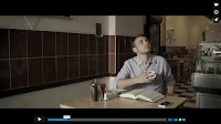
'Musca' is a short film full of tension and suspense with a few comic elements, which shows glints of a dark comedy genre. It suggests that when people die, they become flies, this is established when a fly attempts to communicate with a man in a diner.
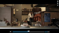
The first long shot of a diner establishes the setting and sets the scene as the camera slowly pans into it as a car drives past, which is accompanied by the diegetic sound of talking and traffic; setting a rural town area. The camera then cuts to a mid shot inside the diner, displaying a young man drinking a cup of tea and reading a book and a cook in the background preparing something. This sets up the Equilibrium in terms of Todorov's model due to the way everything seems perfectly normal.
The man's costume consists of a formal plain white shirt with the sleeves rolled up which makes it slightly informal as well. This suggests that he's perhaps a business man having breakfast before work. His facial expression remains deep in thought as he reads his book.
The cook in the background appears to be preparing something, wearing a costume that consists of an apron and a white top underneath, which is the standard costume for a cook.
This mid shot allows the audience to observe that there's no one else in the diner apart from these two characters.
The camera then cuts to a match on action of the cook placing a roll on the counter with a stern facial expression. A diegetic buzzing sound of a fly is heard as a fly begins buzzing around the roll and shallow depth of field is used to emphasise the movement of the fly around the roll, but to also capture the irritated facial expression of the cook who is out of focus in the background. He shoos the fly away with a swatting motion and continues with what he was doing, with the diegetic buzzing sound remaining. The camera cuts back to the previous mid shot of the young man reading and the camera gradually pans in on him. Diegetic sound of police sirens are heard suggesting trouble and justice, perhaps conveying that this is a fairly troublesome area.
 |
| Long shot of diner |
 |
| Mid shot of man sat in diner |
 |
| Mid shot of cook |
The camera cuts to a close up of the young man's phone which is accompanied by the diegetic sound of a text message displaying a news alert saying: "MAN FOUND DROWNED IN RIVER NAMED AS JOHN BROWN". The camera then makes cuts from close ups of the phone to close ups of the man which displays his facial expression as recognisable of the announcement but then another close up is used to show him swiping the alert away as if it were nothing.
The mid shot of him sitting down reading is repeated again, apart from this time, the diegetic buzzing sound of the fly returns and he looks up slightly irritated as he notices the fly buzzing around him. This is accompanied by slight tense non-diegetic music that creates enigma in terms of Barthes theory of Enigma codes as we become eager to know why this fly appears to be meaningful. The way in which his eyes follow the flight path of the fly creates slight comedy due to the stupidity of following it so intensely. In terms of Neale's theory of repetition, this constant repetition of these comic moments make up the formula for the comic side of the genre.
An extreme close up is used to display the fly on his book and the shot seems slightly magnified, which conveys that the man is focusing very hard on the fly. A cut is made to a mid shot of the man with a confused facial expression as he attempts to brush the fly away. Once again he begins closely watching the fly as it buzzes around him with a curious facial expression; this is the Disruption phase in terms of Todorov's model theory, as the fly begins to disturb the normality. The camera uses another magnified extreme close up to display the fly back on the book but on different words which are "help me". The camera cuts to another close up of the man's confused facial expression as he studies the fly and brushes it away again which applies to the comedy within the sequence as the constant brushing away of the fly emphasises the annoyance of the man.
 |
| Close Up of man's phone |
 |
| Close Up of man |
 |
| Long shot of man looking up |
 |
| Extreme Close Up of fly on book |
 |
| Mid shot of man looking down at fly |
His facial expression remains confused as the camera cuts back to the extreme close up of the sentence that the fly landed on which says "help me". This suggests that he's trying to work out something as if the fly is trying to communicate with him. A cut is made to a close up of the man shaking his head as if he's telling himself not to be so silly as to think a fly could communicate. The same shot of him watching the fly intensely returns and the genre of comedy returns again due to the ridiculous angle and movement of his eyes and head as he scans around to follow the fly which lands back onto his book above the sentence: "Don't be scared". A side view close up of the man allows the audience to see that he's reading the sentence out loud with the same confused facial expression and with the fly still on the page. Another close up is used to show the fly jumping onto the end of his nose which creates comedy as it's as if the fly is trying to mock him. However, instead of swatting the fly away, he merely sits there and let's the fly sit on his nose, the way in which he frowns communicates that he's muddled and doesn't know what's going on.
The camera continues to show extreme close ups of the fly sitting on his book above different sentences such as "I'm real", the side view close up shows the man leaning forward and comically whispering "hello?" as if the fly is going to reply to him. This is comic because he looks crazy and stupid attempting to have a conversation with an insect and then tilting his head to listen out for a reply.
 |
| Extreme Close Up of words |
 |
| Extreme Close Up of fly on book |
 |
| Side view Close Up of man reading |
 |
| Close Up of man reading |
 |
| Extreme Close Up of fly |
The camera cuts to a long shot of the cook in the far end of the kitchen fiddling about with something and seems to be completely unaware of the man's weird actions. A mid shot is used to show the man turning around to ensure that he isn't being watched in order to avoid being thought of as crazy, during this he also lets out a tiny laugh as if he's in disbelief.
The extreme close up of the fly on the book returns as it scuttles over to the word "write" which the man repeats as if understanding the fly as he begins to fumble around for a pen and paper.
A series of cuts are made from extreme close ups of the fly on the book, to close ups of the man writing, this conveys that the man is writing down the words that the fly is sitting above and communicating with it. This sets up the Confrontation phase in terms of Todorov's model theory, due to the way he's attempting to deal with the fly and work out what's happening. The series of cuts quickens the pace and creates tension which applies to the dark side to the comedy due to the way the atmosphere is made tense and uneasy. The camera then pans slowly towards separate extreme close ups of words in the book such as "John" and "Brown", this captures that the man is realising something crucial as he studies the result of his writing and realises that the fly is in fact John Brown who was the person that drowned. Along with the extreme close ups of "John" and "Brown", a sinister non-diegetic sharp sound accompanies the two names which suggests some sort of truth is unravelling. Also at this point, the tense non-diegetic music begins building up to build more suspense as the realisation commences. The diegetic sound of a text message is used again to repeat the news alert of John Brown having drowned in a river. As this happens, a mid shot of the man shows him reading it out loud with a confused facial expression and attempting to talk to the fly, but this is abruptly interrupted by the quick cut to a close up of a roll of newspaper that suddenly emerges and squishes the fly, which is accompanied by a loud diegetic smacking sound. This acts as the Resolution phase in terms of Todorov's model theory, as the fly is no longer alive and can no longer communicate with the man meaning that order is restored. This breaks the tension and adds to the dark side of the comedy due to the brutal killing of the fly and in terms of Altman's theory of conventions, this counts as a fixed characteristic that creates the darkness to the comedy which designs the dark comedy genre. The camera cuts back to the man who has a shocked facial expression. It's confirmed that the cook was the killer of the fly as the camera cuts to a mid shot of him putting the roll on the table and walking away. A cut is made to an extreme close up of the fly completely disembodied on the serviette in which he wrote on, this provides a brutal image which adds to the dark side of the genre and again acts as a fixed characteristic in terms of Altman's theory of conventions. It also adds to the comical side of the genre due to the time spent of the man trying his hardest to work out the situation only for the whole thing to be quickly ended by a simple roll of newspaper. The same mid shot returns of the man sitting at his table and the cook in the background, the camera gradually pans out creating a disheartened atmosphere which mirrors the disheartened facial expression of the man as he stares down sympathetically at the disembodied fly.
 |
| Long shot of cook |
 |
| Extreme Close Up of fly |
 |
| Close Up of man writing |
 |
| Extreme Close Up of words |
 |
| Extreme Close Up of words |
 |
| Close Up of man looking down |
 |
| Close Up of fly getting squashed |
 |
| Medium Close Up of dead fly |
 |
| Long shot of man in diner |
The camera cuts to a side view mid shot of the man stepping into the street from the diner with a concerned facial expression as he gazes downwards at his phone in full concentration. Shallow depth of field is used to draw focus upon him. As he exits the frame, the camera cuts to a long shot of him walking into the road and coming to a stop which is when a van suddenly emerges and hits him with the diegetic sound of breaks squeaking in an attempt to stop that's closely followed by the diegetic sound of a car alarm and people yelling in panic. The camera then pans up to create a worms eye view shot showing another fly buzzing around frantically, accompanied by a diegetic buzzing sound. This is the New Equilibrium in terms of Todorov's model theory. The tense non-diegetic music returns to create a sinister ending and to convey that the fly is the man that's died and come back as a fly just like 'John Brown' did. This creates a chronological Linear narrative as we gain closure and realise the plot, but it also creates a circular narrative as we end up outside the diner, which is where the sequence started.
 |
| Side view Mid shot of man leaving diner |
 |
| Long shot of man walking into road |
The imagination in this short film suggested that when you die you become a fly, the comic moments of the male character ridiculously following the fly and frantically moving his head and eyes to capture it's every movement made it all the more enjoyable to watch. The ending was very sudden and unexpected which is an aspect I thought was gripping and engaging; unexpected endings leave the audience feeling shocked and surprised which are two emotions we wanted to generate by making a part of our shot film unexpected. This short film reinforces the key feature of short films having a Chronological Linear narrative, which is something we used in our short film. However, it also challenged conventions by using a narrative that wasn't realistic and relatable. But it did use a minimal of 2/3 characters, kept within the typical length, (4:11), and used just one protagonist which meant that it also followed typical features of a short film.
OUR SHORT FILM: 'Advance to Go'
Our short film attempts to follow key features of short films, but in places, challenges and develops them. We ensured that it mirrored these key features:
- Keeping within the usual time limit-our short film was just under 5 mins-similar to 'Gone Goodbye' and 'Musca'.
- Had a Chronological Linear narrative-similar to 'Gone Goodbye' and 'Musca'.
- Used minimal characters-we used 4 characters
- Usually realistic-our narrative wasn't realistic in terms of the Supernatual elements but we DEVELOPED this by including realistic money issues which allowed our short film to contain elements of realism whilst sustaining an unexplainable plot-similar to 'Musca'.
- Voiceover/Narration-we decided not to use this feature because we felt that it wouldn't work well with our narrative-'Gone Goodbye' used a voiceover only because he was narrating his own thoughts as we battled with his feelings in a metaphoric way and it explained everything to the audience to avoid confusion.
- One main protagonist-we didn't have 1 main character because all 4 characters were important to the plot and our narrative didn't really require a dominant character to lead the others. However, you could say that Russell is more dominant than the others due to the way he dramatically effects the narrative-'Musca' and 'Gone Goodbye' have only 1 main protagonist that drives the narrative and most of the focus is on them.
- A problem needing to be solved by the protagonist-the characters within the narrative didn't see the board game as a problem to begin with, therefore they didn't see any problems needing to be solved. The only thing they try and do something about is looking for Marion when she disappears and even then they do it as a group and not individually-'Musca' involves the main protagonist attempting to figure out what the fly is trying to communicate and 'Gone Goodbye' involves a heartbroken man trying to solve the problem of his emotional attachments to his ex-partner.
The beginning part of our short film starts with a slow motion effect as a phone drops to the floor in a extreme close up. The main title is positioned in the middle of the frame to dominate the scene. We used a blinking effect on the title in synchronisation with the beeping non-diegetic foley. The lighting is very low key to exaggerate the Thriller/Horror genre and the way the phone topples into the camera and knocks the lens off focus also reinforces the sinister approach we were looking for. This is accompanied by a non-diegetic foley of a beeping phone, this suggests that the phone call has been interrupted and straight away generates enigma for the audience as they already become eager to know why this phone has been dropped and what has interrupted the phone call. In terms of Neale's theory of Repetition and Variation, it's clear that our short film uses a repeated convention of a Thriller/Horror as the audience encounter enigma within the first 3 seconds of the sequence; enigma is often part of the genre formula for a Thriller/Horror. There's also tense non-diegetic music which accompanies the beeping foley in order to increase tension. This opening sequence ends with a sudden plunge into blackness as the camera gets hit by the phone and sustaining the title-leaving the audience in a state of confusion as they wonder what's happened.
 |
| FRAME 1: Extreme close up of phone falling onto floor |
The sequence then fades into a close up displaying wine glasses being filled up with red wine on a kitchen surface which indicates we have switched to a kitchen setting. We edited this part so that quick cuts were made to speed up the process of pouring the wine. This is accompanied by high key lighting and a diegetic gurgling sound as the wine enters the glasses. Positioned on the bottom left corner appears the production company name in the same font as the title, it disappears with the shot.
 |
| FRAME 2: Close up of the wine glasses being filled |
A cut is made to a mid shot of a girl leaning on a kitchen counter. This mid shot allows us to confirm that it's a kitchen setting. Another character enters the frame and places himself on top of the counter with relaxed body language and a calm facial expression.
The mid shot also allows the audience to observe their casual costumes conveying their young adult age of roughly 18/19.
 |
| FRAME 3: Mid shot of first two characters in kitchen setting |
The sequence then cuts to a close up of the female character as she starts the dialogue. Her facial expression appears calm as she talks to her partner. This shot kick starts the shot reverse shot sequence as they talk about their plans for that night; the shots flicker between close ups and slight mid shots. We ensured that we edited these shots so that any unneeded space in the shots were cut out to create a neat and tight shot. This is also the first parts of dialogue in the film which inflates the importance of it as the dialogue leads to the retrieval of the board game. The lighting remains high key to emphasise the calm atmosphere. (I am counting as the shot reverse shot sequence as frame 4 to allow more analysis on other interesting shots).
 |
| FRAME 4: Mid shot of female character talking |
 |
| FRAME 4: Mid shot of male character talking |
 |
| FRAME 4: Close up of female character talking |
 |
| FRAME 4: Mid shot of male character talking with an unimpressed facial expression |
The shot cuts to a long shot of the male character exiting the frame to go and retrieve the board game. His body language becomes loose and gangly as he trudges off to the cupboard.
 |
| FRAME 5: Long shot of male character exiting the frame with loose body language |
A cut is made to a match on action of the male character opening the cupboard and retrieving the board game. (Counting these two shots as both frame 6). It's clear we have switched to a downstairs bathroom setting due to the tiles and sink in the background.
 |
| FRAME 6: Mid shot match on action of male character opening cupboard |
 |
| FRAME 6: Close up match on action of male character looking into the cupboard |
Another cut is made to an over the shoulder shot of the male character looking at the board game which is accompanied by a non-diegetic foley doorbell sound. The camera also pans down slightly to follow his head as he looks down at the board game.
 |
| FRAME 7: Over the shoulder shot of male character looking at board game |
It then cuts to a mid shot of the female character walking down the corridor to answer the door in response to hearing the foley doorbell The lighting becomes more low key which suggests that things are just beginning to become more sinister.
 |
| FRAME 7: Mid shot of female walking to the door |
The sequence then cuts to a long shot of the first two characters opening the front door and greeting two more characters. The dialogue returns as they greet each other and it becomes clear that the new female character is the same social class as the first two characters due to her costume being similar in terms of a casual style. However, the new male character appears to have a smarter costume therefore appears as a higher class which is reinforced by the way he talks and his body language.
 |
| FRAME 8: Long shot of new characters coming through the door |
The 9th frame consists of a mid shot of the two female characters sitting on the sofa chatting. The dialogue that's heard is vital due to the way the new female character questions when her friends parents are back which immediately indicates to the audience that the owner of the house is having this gathering due to her parents being away, meaning they aren't due to arrive anytime soon. Their body language is relaxed which shows they are close friends as they continue to gossip and have amused facial expressions.
 |
| Mid shot of female characters gossiping |
The film poster promotes the film and attracts the target audience, therefore it's an important factor in advertising the film. Film posters have certain conventions that have to be followed in order to create a successful one. These conventions include:
- Name of the starring actors
- Pictures of the starring actors in/out of character
- One main image usually from the film
- References to other films
- Cultural references and taglines
- Website
- Critics praise for the film
- Rating system
- Billing block
- Age certification
- Release date
- Main title

Shades
of Hope is a portrait short film poster in which displays the main
image of a solider character. This reveals part of the narrative as it
becomes apparent that the plot is most likely war based due to his
army-like costume and the gun prop. The character is positioned upon a
blend between a dark sky and the American flag. This also reveals part
of the narrative as it's obvious that this war based film is focused on
America. The use of the helicopter images and explosions that lurk in
the background also portray the idea of war and enhances the conflict
theme. The war and conflict themes generate an Action War genre in which
involves semantic codes such as guns and helicopters that imply
syntactic codes such as explosions, death and war-in terms of Altman's
theory. These props are often repeated conventions within an
Action War film and we generally associate these props with a conflict
film, according to Neale's theory of Repetition.


The
soldiers body language hides his facial expression due to the way his
head is dramatically bowed in a sorrowful way. The rest of his body
appears to be stiff and still to reflect the strictness of army life.
His body language works with the title 'Shades of Hope' as his sorrowful
posture implies that he's hoping to live perhaps.
The
main title itself is coloured white in order to appear visually
appealing positioned on top of a dark and gloomy background. The use of
pathetic fallacy allows the background to reflect the sinister war zones
and the danger of conflict. The font is fairly thin and traditional
which creates a classic looking appearance. In fact, all the text
including the billing block, release date and the actors names are all
coloured white which creates a clear theme running through the poster.
The billing block is aligned both sides meaning the gap from the edge is
equal on each side. This is the same for the title and actors names;
the film poster appears as professional and carefully constructed if the
text is aligned correctly and doesn't differ on each side.
The
poster uses low key lighting to represent the doom and gloom of the
conflict theme and to emphasise the need of hope which reflects the
title. The title is the biggest text on the poster which follows the
film poster convention of always ensuring that the main title is the
biggest piece of text as it's the most significant. This would attract a
male audience due to the manly theme of war which most females wouldn't
find appealing. It would appeal to young males possibly as young as 16.
I also analysed a high budget film poster in order to compare the difference in terms of content and style between a low budget poster and a high budget:

'Jumanji'
is a portrait film poster that's main image is central and consists of a
board game with a stampede bursting out of it. This implies a Fantasy
and Family genre due to the unrealistic image of animals coming out of a
board game. This suggests that the audience is a family based
demographic due to the Fantasy genre and the harmless appearance of the
narrative conveyed by the poster and it's images. This also reveals
aspects of the narrative due to the main image displaying the board game
that's clearly called 'Jumanji', which reveals that the film is focused
on that board game because the title is also 'Jumanji'. It's also
revealed that this board game may be magical and supernatural due to the
unrealistic suggestion of a board game producing a stampede. It's clear
who the main character is as he's the only character visible on the
poster. He's positioned playfully clinging onto the main title which
conveys Adventure and chaos, which works together with his exclaiming
facial expression displaying panic. His age and class is represented by
his costume and hair; his hair is neat and tidy which conveys that he's
well groomed and cares about his appearance. His shirt is checked and
creates a formal and smart appearance, despite the fact we can only see a
tiny part of his costume, suggesting that the poster wants us to focus
more on the main image in the background. The main image also displays
small houses next to the board game, these houses seem rather big and
wealthly looking which could suggest that the setting in the film is
fairly upper class and powerful.
Looking
at the poster, we are positioned at a low angle which almost
personifies the board game and assigns power and control to the board
game which further reinforces the super natural theme. This relates to
Altman's theory of fixed characteristics and how super natural
and magic are both themes often found and associated with a Fantasy
genre due to the unrealistic occurrences and unexplainable events. This
can also relate to Neale's theory of repeated conventions; the
magical and super natural theme constructs the Fantasy genre and
conjures up a formula in which directors follow in order to successfully
portray that particular genre.
The
main title font reflects the font on the board game which creates a
link between the plot and the poster. It also allows the title to become
more memorable. The font is bold and slightly curvy with slightly wonky
edges to perhaps reflect the chaos and craziness of the narrative. It's
centrally positioned at the bottom of the poster with an even alignment
either side. The half orange half red colour has connotations of heat
and fire which may suggest that the film is action packed, or those
colours are used to allow the title to appear as abstract with a white
outline, against the darkness of the background.
The
main actor's name is significantly positioned at the very top of the
poster and the letters are evenly spaced out to demolish any dead space.
The font is thin and traditional looking which conveys that the actor
is well-known and important in the world of acting. It's also the only
name displayed which further reinforces how important he is. It also has
even alignment each side which creates a neat and organised looking
poster. It's also positioned onto a dark blue background that looks
stormy and cloudy which is done to further establish the drama and to
show pathetic fallacy of how hectic the narrative is and the use of
white being the text colour, allows it to successfully stand out boldly,
despite the thin font.
The
white coloured text is sustained with the billing block which is
positioned directly at the bottom of the page, equally aligned. Above
the billing block is the slogan which reveals more of the narrative: "ROLL THE DICE AND UNLEASH THE EXCITEMENT!". The
use of upper case allows the text to look bold and significant and the
way in which the beginning letter of each word is bigger than the rest
of the words enhances the significance and the exclamation. It reveals
parts of the narrative by suggesting that playing the board game will
generate chaos and heart racing events, as the use of an exclamation
mark at the end of the slogan conveys energy and anticipation, another
two repeated conventions of a Fantasy film in reference to Neale's theory.
The
poster is fairly low key lighting with glints of high key. This
reflects the fragmented action that's on and off, revealing more of the
narrative.
OUR FILM POSTER

Our film poster mirrors some of the conventions required due to the way we have included the starring actors names, ratings, critics praise, main title, main image and a billing block.


However, we have missed out the release date, image of the actors, references to other films, a tagline, website and an age certification.
We also made it landscape to mirror most film posters as they are rarely positioned as portrait. The black background allows the main image to appear more dominant and also reflects the Supernatual elements by connoting death, darkness and evil. The main image delivers the Monopoly theme along with the Monopoly pieces which allows parts of the narrative to be visible.

We made sure that any text positioned on the black background is coloured white in order to be properly visible and to connote ghostliness which reflects more of the Supernatural theme.
LWL REVIEW
What is Little White Lies? Who reads it?


What are the layout of a Little White Lies review?


 The
layout seems to have a running theme of abstract photography in which
causes the magazine to seem artistic and creative due to the bright
colours and unique images. It also generates excitement for new film
releases and keeps their target demographic entertained as well as
updated. The Black Swan issue has a video: A Magazine Is Born. It demonstrates the hard work of the designers as they perfect the magazine.
The
layout seems to have a running theme of abstract photography in which
causes the magazine to seem artistic and creative due to the bright
colours and unique images. It also generates excitement for new film
releases and keeps their target demographic entertained as well as
updated. The Black Swan issue has a video: A Magazine Is Born. It demonstrates the hard work of the designers as they perfect the magazine.


HOW HAVE WE FOLLOWED THE CONVENTIONS OF A LITTLE WHITE LIES POSTER?
In order to successfully mirror the conventions of a Little White Lies review, we had to follow these exact instructions:
We decided to use this main image from our film because we felt that it successfully portrayed the genre and narrative whilst delivering the Monopoly theme. We also ensured that it was positioned at the top of the review:

Positioned under the main image is the main title and the directors names followed by the names of all starring actors. It had to be in the required font and size:
 Under the main title,etc. is the actual review text. It consists of the required font demonstrated in the video a bit further up and also uses a drop capital to kick start the review.
 The rating system is positioned on the right hand side of the review along with the review sign a bit further up:


All of these features contribute to the success of the review in terms of targeting the Little White Lie's audience. Combined together, they create this:

A well presented and professional-looking review.

We made sure that any text positioned on the black background is coloured white in order to be properly visible and to connote ghostliness which reflects more of the Supernatural theme.
LWL REVIEW
What is Little White Lies? Who reads it?
 |
| Little White Lies magazine |
Little White Lies is a bi-monthly British independent movie magazine that's published by The Church of London.

The Church of London also publishes Huck which is another magazine that explores the many facets of radical culture.
 |
| Huck magazine |
What is the content of Little White Lies?
The magazine features a variety of things that appeal to their target demographic. It includes features such as:
- Film reviews
- Adverts
- Interviews
- Photography
It's split into six chapters: the lead review, an editorial introduction, a series of articles inspired by the feature film, theatrical reviews, the Back Section and future releases.
 |
| Inside spread of Little White Lies |
 |
| Inside spread of Little White Lies |
Who reads it?
Demographic audience:
The magazine ensures that the content appeals to their target audience, therefore they carefully consider what features in their magazine. Statistics from 2008 show that the magazine is popular with people aged from 25-35 (51%) that work in the Media industry (22%) and are mostly male (63%). It's clear that Little White Lies have constructed their magazine to appeal to these people.
Psychographic audience:
The people reading this magazine will have an interest in films and critics and will have their own opinion on their favourite films. Statistics from 2008 show that most people hardly went to the cinema, (72%), to see films due to the popularity with DVD's at the time which was before online streaming. The statistics also show that 93% of readers read the magazine from cover to cover and kept their copies after reading them.
Adverts
Some of the adverts appeal to the male demographic due to advertisements for beer and other male specified things. However, not all the adverts are targeted for males, some of them suggest that the magazine are targeting well-educated people of both sexes that are high class due to the feature of advertisements such as BBC Proms which would include high class/classical music and 1% for the Planet which would include environmental issues that caring higher class people would be usually concerned about. The cost of the magazine is now around £6 which also demonstrates the higher class demographic due to the expense of the magazine which lower class people wouldn't want to purchase because of how much it is; they would probably prefer a celebrity gossip magazine such as Heat magazine at a lower price of roughly £1.65.


What are the layout of a Little White Lies review?
As stated before in my previous post, the magazine is split into 6 chapters: the lead review, an editorial introduction, a series of articles inspired by the feature film, theatrical reviews, the Back Section and the future releases. The magazine dedicates its front section
to an upcoming release, drawing inspiration from the themes and visual
tone of the film. The back section features essential reviews of the
latest theatrical releases, plus exclusive interviews, festival reports
and more.
It also uses a tripartite ranking system consisting of the categories: Anticipation, Enjoyment and In Retrospective. They are marked out of 5 and justified with an explanation.
Design
The design of Little White Lies is
inspired by it's feature film which is represented by the cover of the
magazine as it displays an illustration, usually of the lead actor. The
cover film also influences aspects of the design such as editorial
icons, chapter headings and custom typefaces. But overall, the design of
the magazine remains the same to create a recognised reputation for the
institution. The inside spreads of the magazine consist of the same
sort of thing, being vast amounts of reviews and interviews, etc. with
bold imagery placed on the side of the text or in the middle of the
page. Other pages consist of adverts, but not too many like a mainstream
celebrity gossip magazine such as OK magazine, which consists of lots of adverts and pages that are trying to sell you items:

This Little White Lies issue has displayed their feature film, The Mask, clearly due to the lead actor, (Jim Carrey), on the front of the issue:
And this issue's feature film is clearly The Black Swan
due
to the illustration on the front of the issue consisting of the lead
actress and the title of the film largely displayed overlapping the
image.

 The
layout seems to have a running theme of abstract photography in which
causes the magazine to seem artistic and creative due to the bright
colours and unique images. It also generates excitement for new film
releases and keeps their target demographic entertained as well as
updated. The Black Swan issue has a video: A Magazine Is Born. It demonstrates the hard work of the designers as they perfect the magazine.
The
layout seems to have a running theme of abstract photography in which
causes the magazine to seem artistic and creative due to the bright
colours and unique images. It also generates excitement for new film
releases and keeps their target demographic entertained as well as
updated. The Black Swan issue has a video: A Magazine Is Born. It demonstrates the hard work of the designers as they perfect the magazine.
The layout of the magazine can stretch from beautiful photography to abstract illustrations to carving!
The company design their magazines specifically to attract their target
audience and in order to be unique they began using techniques that
were abstract and different meaning that their magazine would begin
gaining interest and attention from their readers and from the press:

This unique take on design proved to be successful with it's readers:

HOW HAVE WE FOLLOWED THE CONVENTIONS OF A LITTLE WHITE LIES POSTER?
In order to successfully mirror the conventions of a Little White Lies review, we had to follow these exact instructions:
We decided to use this main image from our film because we felt that it successfully portrayed the genre and narrative whilst delivering the Monopoly theme. We also ensured that it was positioned at the top of the review:

Positioned under the main image is the main title and the directors names followed by the names of all starring actors. It had to be in the required font and size:


All of these features contribute to the success of the review in terms of targeting the Little White Lie's audience. Combined together, they create this:

A well presented and professional-looking review.
Q2: How effective is the combination of your main product and your ancillary tasks?
Pre-Script for video:
Any film, whether it's a low budget film or a mainstream film, requires a good marketing campaign to promote the film's genre and content to the chosen target audience. One method of creating a successful marketing campaign is using a film poster to introduce the film and to entice the target audience, persuading them to watch it. Once the Distributor has found the films Unique Selling Point, decided on the target audience and set a release date, they begin the campaign. It needs to grab the attention of the viewers as a result of other competing campaigns in the film industry, whether it be on the TV/Cinema, internet, Newspaper, Magazine or an advert splurged across the side of a bus. All aspects of a marketing campaign need to work in synergy to promote the film and to create a reputation for the film which causes it to be recognisable and therefore immediately associated with that specific film, for example - the font and logo used for the mainstream film Batman title becomes recognisable and people begin associating that font with Batman and the Batman films. Our short film poster for Advance to Go also uses a recognisable title to create a reputation for the film. We ensured that our target audience would feel engaged and persuaded when seeing our film poster, so much so that they would want to go and see it straight away. As I said before, the film poster is important because it reveals the genre and conveys some content to the target demographic. As a group, we created a title that reveals the theme and some of the content by replicating a Monopoly square with our title consisting of a similar font and image to the Monopoly board. It's clear that it's the title due to the way we have enlarged that square so that it appears bigger than the others and it's also positioned in the middle of the landscape poster. The red arrow underneath the title is what is found underneath the 'GO' square on a Monopoly board, therefore the audience will make a link between the two and will notice the Monopoly theme which obviously means that the film is based on the board game. The poster also displays the Monopoly pieces and some dice, which communicates to the audience that the game will be played during the film at some point and will consist of four players due to there only being four counters displayed on the poster. We have also stuck to using the same colours as an original Monopoly board, being a slight grey/green colour for the tiles and the strip of colour at the top of the tiles which indicate the same set of streets. We even used two of the street names to ensure the Monopoly theme was even more obvious than it already is!
The genre is communicated to the target demographic by the use of the dark black background that the Monopoly tiles are sat upon. Black connotes death, evil and darkness to the audience, therefore they can associate these connotations with a Thriller/Horror genre due to the lack of brightness and cheerfulness in the background. The white text at the top and bottom of the poster which consists of the starring actors and the billing block are coloured white which further reinforces the Thriller/Horror genre due to the ghostly and spiritual connotations depicted from that colour. Overall, the theme, content and genre are successfully conveyed in the sense that the audience feel eager to know more, therefore they would go and see the film.
Also, Film Festivals such as Cambridge Film Festival and Portobello Free Film Festival offer young filmmakers the opportunity to show their films in front of a live audience which is another way of delivering a film to the target demographic. It gives short films the boost they need in the film industry.
Also, Film Festivals such as Cambridge Film Festival and Portobello Free Film Festival offer young filmmakers the opportunity to show their films in front of a live audience which is another way of delivering a film to the target demographic. It gives short films the boost they need in the film industry.
Another marketing method is using a film review to show the target audience what others think after watching the film. The review can be good or bad but it mostly depends on the opinion of the viewer. The review works in synergy with the poster to reveal aspects of the film without giving away too much detail. The review however is critical and comments on the good and the bad of the film which will either put some viewers off or encourage them all the more to go and watch it. Taking into account that the review is written by the Little White Lies company, it's important to remember that they target a different audience; the magazine ensures that the content appeals to their target audience, therefore they carefully consider what features in their magazine. Demographic statistics from 2008 show that the magazine is popular with people aged from 25-35 (51%) that work in the Media industry (22%) and are mostly male (63%). It's clear that Little White Lies have constructed their magazine to appeal to these people. These people will have an interest in films and critics and will have their own opinion on their favourite films. Psychographic statistics from 2008 show that most people hardly went to the cinema, (72%), to see films due to the popularity with DVD's at the time which was before online streaming. The statistics also show that 93% of readers read the magazine from cover to cover and kept their copies after reading them.
Some of the adverts appeal to the male demographic due to advertisements for beer and other male specified things. However, not all the adverts are targeted for males, some of them suggest that the magazine are targeting well-educated people of both sexes that are high class due to the feature of advertisements such as BBC Proms which would include high class/classical music and 1% for the Planet which would include environmental issues that caring, higher class people would be usually concerned about. The cost of the magazine is now around £6 which also demonstrates the higher class demographic due to the expense of the magazine which lower class people wouldn't want to purchase because of how much it is; they would probably prefer a celebrity gossip magazine such as Heat magazine at a lower price of roughly £1.65.
The language tends to be complex and chatty at the same time which allows the review to carry undertones of seriousness but also to seem friendly and engaging to read. Little White Lies likes to use a variety of styles when writing in order to appeal to their target demographic. The style can vary from:
- Nouns/complex nouns
- Complex sentences
- Restricted Codes in language
- Adverbs
- Metaphors
- Puns
- Adjectives
- Rhetorical questions
It was a challenge to successfully mirror these aspects of a LWL review but with some feedback and some group effort, we managed to construct a review in the style of a LWL review. We ensured that the language used was complex and at the same time chatty, in order to break the monotone effect and to add some youth to it. Our use of different word styles proved to be successful when re-reading the review as each criticism is explained using several adjectives and adverbs to ensure an accurate reflection of a LWL review. When it came to the rating system, we were fair and just when allocating marks out of 5 because we didn't want to appear biased. But overall, I think we successfully reached the LWL target audience and managed to stick to the different styles and conventions by following the measurements and instructions.
HERE IS THE VIDEO:
HERE IS THE VIDEO:
Q3. What have you learnt from your audience feedback?
 Audience feedback is vitial when it comes to altering things and changing things for the better during the editing process. We managed to gain a stable amount of audience feedback on several aspects of our project. Our main goal however is to gain feedback from our target demographic which is young adults aged from 16 - 25 male AND female.
We used methods such as recording people watching our film and capturing their feedback right after they had seen the sequence. This proved to be a good method in terms of gaining accurate feedback because we were able to change things there and then which we realised were a problem due to the critisim we recieved from the viewer. We also used social media sites such as Facebook and Twitter due to the vast amount of people it would reach. We were able to study the comments that people made and apply those changes to our short film. We also asked people whether they liked our overall ideas
for our short film using the survey creator, 'SurveyMonkey' and 'The
Student Room'. We chose to use these websites as our target demographic would be familiar with these websites
as they are used often day-to-day, and so this would give us reliable
data that we can positively use towards our film. We also used the
website 'The Student Room' as again, our target audience would be most
likely to use this website as it is predominately aimed towards students
in college or university, hence the name.
These are the surveys from SurveyMonkey:
 |
| Answer is Yes |
 |
| Answer is Agree |
 |
| Answer is good |
 |
| Answer is Yes |
 |
| Answer is Yes |
We quickly reacted to these comments and immediately ensured that we applied these thoughts to our short film.
Q1: Do you think using a time-lapse would be a good way to accelerate time in order to make our short film more engaging and less boring?
Most of them responded to this question by choosing 'Yes' which confirmed the use of a time-lapse. We did a time-lapse test to observe the outcome before going ahead with it:
Some people chose 'No' which could be because sometimes time-lapse's turn out quite messy and don't suit the structure of the film. Another reason for choosing 'No' could also be that it may risk the audience missing out on details during the time-lapse that aren't actually visible due to the pace of the time-lapse. Despite this, we decided to go ahead with it and we were very pleased with the end result as we feel that it added uniqueness to our film and freed up more space for other crucial shots.
Q2: How far do you agree that all Thrillers should include 'enigma' and anticipation?
Most of them responded to this question by choosing 'Agree' which meant that we included elements of ananticipation and enigma. We were able to include these aspects of a Thriller by using tense and uncomfortable non-diegetic sounds when we wanted the atmosphere to become sinister. We also played around with the lighting to change the atmosphere and to enhance the suspense. These are noticeable firstly when the invoice arrives; we used a tense non-diegetic sound to enhance the start of the sinister events. The invoice also generated enigma as the audience began to wonder what was going on. Enigma and anticipation are demonstrated further when the power cut occurs and everything started going wrong.
 |
| Power cut scene |
 |
| Arrival of invoice |
Q3: What are your thoughts on the idea that a board game comes to life (similar to Jumanji; using the board game 'Monopoly' as an example)?
Most of them responded to this question by choosing 'Good' which confirmed our idea and our theme. It's obvious that we used the Monopoly board game theme due to our film poster and review working together with the short film to promote the idea of a board game coming to life. It's more than obvious that the board game possesses some sort of power when the characters begin recieving real money.
Some people may of chosen 'Bad' because they may of felt that it wouldn't be no where as good as Jumanji due to the use of the Monopoly board game being quite serious and boring because of the money related theme it has. But as a group, we decided that it was a simple idea which we knew would be an interesting narrative to chuck out into our target audience.
Some people may of chosen 'Bad' because they may of felt that it wouldn't be no where as good as Jumanji due to the use of the Monopoly board game being quite serious and boring because of the money related theme it has. But as a group, we decided that it was a simple idea which we knew would be an interesting narrative to chuck out into our target audience.
Q4: Is the idea that the board game having a good and bad side, a good idea?
Most of them responded to this question by choosing 'Yes' therefore we incorperated this idea into our sequence and made sure it was evident that the board game was benefiting them AND damaging them by firstly showing the audience how it was giving them money and then showing the audience that it had taken one of the characters and killed them.
 |
| Character laying dead on the floor |

Q5: Is the title 'Advance to Go' a good idea for a Monopoly-themed short film?
Most of them responded to this question by choosing 'Yes' which confirmed our idea. We used this title and it proved to be successful because people associated the title with Monopoly when they saw it.

Q4: Prezi
Tremendous effort here Zoe - very well done! This is already very strong work, but there are a few points I would make which are similar to points made on Joe's. There is fantastic detail here, and you have extended this to the ancillaries too. Just remember though that the evaluation shouldn't look like a re-posting of original research that may have appeared earlier in the blog. Your detail should always be expressed in the past - these were the details you found in the research period, and should be reflected upon in the evaluation in the context of the finished products. So it's important to keep comparing your examples, to link to the conventions you are demonstrating that you found, and to keep making comparisons between these real films and your own short film. I suggest it might be better to shift the summary of conventions of short films and your use of them (shown in red later on) to the top and then show in depth where these ideas came from. Remember the purpose of this is to evaluate your research and planning rather than restate the analysis. Make sure that you frequently refer to the ways in which you took your research forward - this is in order that you are answering the question. The work on the ancillary products is detailed but less visually interesting than the earlier and excellent presentation. Try to make it this good throughout. This is currently lower level 4 - try to get to the top on this!
ReplyDeleteOn question 3 - take a look at my comments on Joe's answer, as yours is similar. You need to think about the gaps in your questions, and evaluate the ways in which you perhaps could have developed your work on the respondents' answers. For example - what other possible ways of interpreting their positive answer to the Jumanji idea are there? Discuss this further with me tomorrow if you want.
ReplyDelete