http://prezi.com/cbkhtedtav5h/present/?auth_key=3pvhtv3&follow=xrwq7uypkg1r&kw=present-cbkhtedtav5h&rc=ref-178578624
Above is a Link to the 'Prezi' answer to question 4. Here I discuss the The various positives and negatives we encountered along the way.
Tuesday 19 January 2016
Monday 18 January 2016
Q1. Evaluation
1. In what ways does your media product use, develop or challenge forms and conventions of real media products?
Established short films (not ours)
- Here is a number of short films varying in; camerawork, sound, mise en scene, editing/post production, genre conventions, narrative organisations, characterisation and themes
 Mary Last Seen-Analysis
A young woman embarks on a road trip with her boyfriend to a place he promises will be beautiful and peaceful. But a series of strange events occur on their journey, and it becomes clear that their relationship is not what she thinks and their destination is not what was promised.
Through elements of media language it is evident there are some clear distinctions between the two previous examples. In this particular text we can see two contrasting images from two different settings, an approach neither 'Chief' nor 'Must Peeter' conveyed. The first image conveys two individuals, male and female portraying intimate and passionate emotions towards each other, connoting an intense and infatuating atmosphere. However due to other aspects of media language the relationship appears to be a facade, revealing a darker meaning and impression behind their expressed emotions. For example the low key yellow lighting on the decor denotes an urban motel or hotel environment, somewhere the couple do not live permanently. This is supported further by the decor its self, on the wall is an area where a mirror would usually be, however it appears to have been ripped or removed from the wall, implying that people have been before them, and is in fact public accommodation. In the second image we can see a male character elevated from the ground, although there is no way to clarify a clear link to the male character in the first image as we have no way of observing any facial expressions, it is most likely-based on the synopsis- that it is in fact the same person. The dark and bleak setting of a grey sky helps to support a dark unexpected secret behind the the relationship displayed in the first image. One possible connotation of the levitated male character could be that he symbolises exclusion and insulation from society and more importantly his relationship. From observing the text it appears that the sequence represents a male and female demographic, possibly targeting couples who admire a dark twist to their entertainment and therefore placing the target audience in a young adult band i.e 18-25 years old. From analysing the media language in more detail the sequence appears to fall into the thriller/drama/independent genre.
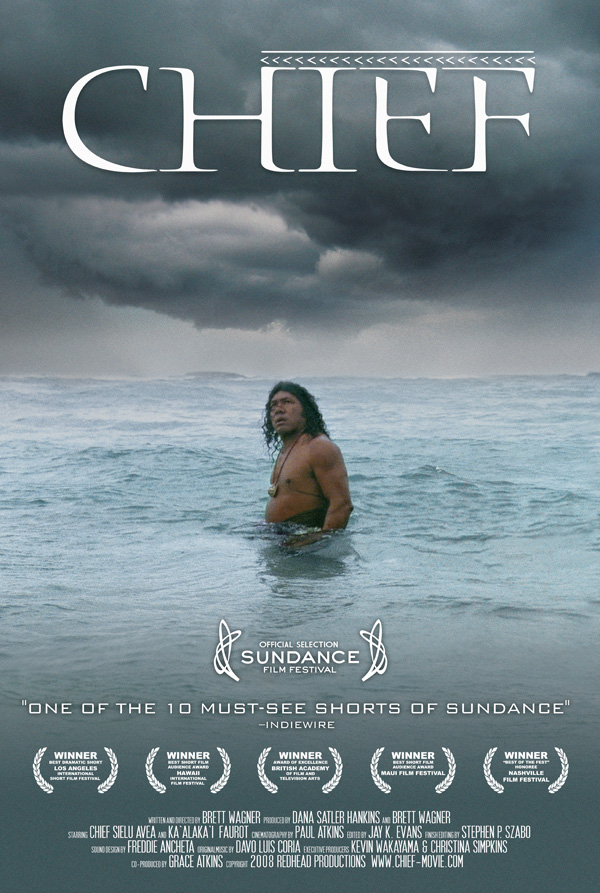
The title and accreditation presentation is unorthodox and deviates from other short film posters. For example critic reviews and film associations aren't displayed on this particular poster, with the exception of a Sun Dance Film Festival award located in the top left corner of the poster. The titling its self is a lot smaller in terms of font size in comparison to 'Chief' and 'Must Peeter', the designer has decided to display a simple block text font contrasting red and black between three words. One possible meaning behind this could be a representation of male and female.
Another aspect to take into consideration is the composure of the elevated male figure, he is centered in the middle of the title, again supporting the connotation that he is divided from the relationship with the female character as they both have conflicting personalities.

through elements of media language, this poster portrays a dark and sinister atmosphere. The camera angle is at a low angle giving the impression that the audience is looking up at the character and in turn connoting an autocratic power about Peter. The lighting in this poster also further supports an aery environment by casting shadows on both the setting and the facial expressions of Peter, which overall denotes a menacing image. One significant prop in the text is the cigarette placed in Peter's mouth which connotes an impulsive and addictive personality, revealing that the character is in fact someone who lives their lifestyle on the edge. From analysing the previous poster 'Chief' it is is evident that there are some similarities in terms of representation. Like 'Chief', 'Must Peeter' conveys only one male character at the center of the text, implying that the sequence represents, again a elder male demographic, aged 20-40 years old. Which therefore means the target audience holds a similar market. From analysing the text from a perspective of someone who hasn't yet observed the short film, it appears to fall into a Thriller/Drama genre, this is supported further by the media language discussed above.
Unlike 'Chief', the titling for 'Must Peeter' takes a different approach both in terms of font style, font size and composition in the frame. The font is an unusual block serif sans font connoting a vintage feeling, accompanied by the characters costume it is quite possible the sequence is based in the 1970's. The size conveys an element of simplicity but yet bold power at the same time, which is a contrasting difference to 'Chief'
 It's the place you go if your own island isn’t big enough. It's the
place you go to disappear. Semu Fatutoa was once a highly ranked Samoan
Chief. Technically, he still is; the tattoos shrouding his legs are
immutable proof of the pain he endured to earn his title. But those
tattoos cost him something else: His daughter, nine year old Aveolela,
drowned in the ocean on the day Semu received the tattoos. Weakened by
the gruelling ceremony, he lacked the strength to swim out to save her.
No one blamed him for her death, but Semu blamed the tattoos. Rather
than assume his chiefly duties, he fled. Two years later and thousands
of miles from home, Semu is the only cab driver in Honolulu with the
rank of Chief. He ferries tourists and Japanese businessmen to and from
the airport. He drives in circles, keeps his legs covered, and slowly
forgets his old life. But his old life wants him back. First, there is
the mysterious Samoan staking out his apartment in Waikiki, calling him
on the phone, following him home from the beach. Then there are the news
reports: An earthquake on the Big Island threatens to unleash a tsunami
on the city of Honolulu; anyone with any sense is heading for higher
ground. Probably the Chief would go, too, except for the eight year-old
Hawaiian girl wandering the city in her bathing suit. She has crossed
his path twice today, and both times he let her go. But now the girl's
intrusion into his sequestered life begins to feel to Semu like a
message. A calling. Any minute now, these streets will be silenced by a
wall of water. Semu begins to realise that it's high time he started
living up to his title.
It's the place you go if your own island isn’t big enough. It's the
place you go to disappear. Semu Fatutoa was once a highly ranked Samoan
Chief. Technically, he still is; the tattoos shrouding his legs are
immutable proof of the pain he endured to earn his title. But those
tattoos cost him something else: His daughter, nine year old Aveolela,
drowned in the ocean on the day Semu received the tattoos. Weakened by
the gruelling ceremony, he lacked the strength to swim out to save her.
No one blamed him for her death, but Semu blamed the tattoos. Rather
than assume his chiefly duties, he fled. Two years later and thousands
of miles from home, Semu is the only cab driver in Honolulu with the
rank of Chief. He ferries tourists and Japanese businessmen to and from
the airport. He drives in circles, keeps his legs covered, and slowly
forgets his old life. But his old life wants him back. First, there is
the mysterious Samoan staking out his apartment in Waikiki, calling him
on the phone, following him home from the beach. Then there are the news
reports: An earthquake on the Big Island threatens to unleash a tsunami
on the city of Honolulu; anyone with any sense is heading for higher
ground. Probably the Chief would go, too, except for the eight year-old
Hawaiian girl wandering the city in her bathing suit. She has crossed
his path twice today, and both times he let her go. But now the girl's
intrusion into his sequestered life begins to feel to Semu like a
message. A calling. Any minute now, these streets will be silenced by a
wall of water. Semu begins to realise that it's high time he started
living up to his title.
Through elements of media language we get the impression that the theme has a native and primitive atmosphere and is evidently not stereotypically based in an urban environment. This is supported further with the main protagonist placed waist hight in an ocean, he is wearing a native costume, revealing a bare torso allowing his necklace to be shown, this further supports the primitive and native atmosphere constructed by the poster. From researching other similar short film posters there appears to be a pattern in the use of at least two different photographs converging to form one. For example 'Brighton Rock' displays two possibly three contrasting photos merged to make a striking final image. The 'Chief' poster appears to have applied only one photo, which in turn constructs a stronger sense of reality and eliminates the hyper-real aspect that many other film posters seem to convey. From analysing the synopsis and the text, 'Chief' represents the male demographic, as the primary character is a male and appears to be the soul of the short film, this is demonstrated through the text in the poster and the synopsis. The unusual and unorthodox plot to the story places the sequence in an independent, drama genre which is not uncommon amongst short film sequences as the are known for deferring away from iconic Hollywood film narratives. From the evidence provided above 'Chief's target audience is aimed at the elder adult band, 20-40 years of age and predominately male.
The title in this text is a typical example of symmetrical alignment. We can see two equal opposing gaps between the page margin and the text, giving a sharp and professional feel for the viewer. the font size is far from abnormal, however it is larger than most of the posters I have researched. The font type is unusual and has a significant influence on the over all impression of the text, implicating, again, a native and uncivilised culture, its sharp serif sans font connotes an old, outmoded atmosphere to the audience
Touch is a Romantic short film that represents one women's journey through life with her partner. the sequence follows a circular narrative.
In the opening scene we are presented with a ECU/BCU of an elderly female character with her eyes closed. the duration of the shot is ephemeral, almost immediately cutting to a different location and and a different female character, judging on the quick transition time we can tell that the elder female character in the initial shot is reminiscing about her past and her youth. The camera then introduces a young male character, throughout the introduction scene of the male and the female character the shot size stays consistent (MCU-BCU) allowing the audience to only see the two characters and no one else around them not even by standers or extra's. This approach to filming gives the two characters the only spotlight and focuses all attention on their story.
 As the narrative progresses we see a consistency in the fast frequency speed in the cut shots, as there are many different locations that the two characters are in i.e from when they first meet too their fourth and fifth date. The director has successfully used his ingenuity to grab the audience and and keep them glued to the journey of the couple.The shot on the left hand side is one of many ECU's in this sequence, I believe the director has chose this method of filming to portray intimacy and true love, by showing no characters around them through camera size and not even enough room to see decor and setting means you can only observe-as a member of the audience- the facial expressions and body language of someones journey of love.
 One particular scene shows the two characters intimately making love in a bed, the camera is at an ECU of their two hands together. there is then a sudden cut to another location and another situation, the male character is now standing and the female is lying down the camera slowly pans across the female character and reveals to us that she is pregnant however the characters are still holding hands. I believe this is a connotation of loyalty.
A Hero is a short comedy about a man who believes he has supernatural powers, the sequence follows a linear narrative and all though its structure is fairly simple the narrative is very comical. The short film is also a documentary/biography which constructs a socially realistic atmosphere and in my opinion is the true fact as to why it comical.
 In the second scene we are presented with a BCU of the characters face accompanied by a narration in the background asking the hero if he claims that he has super powers. The camera is focused on one quarter of the characters head, allowing us to only see his left eye, left check and left side of his hair. This is an unusual angle but seems to connote this particular characters unusual personality.
 As the sequence progresses we are shown in more detail the absurd and entertaining claims that the hero has. For example one scene shows the 'Hero' at a CU with his forehead pressed against a brick wall. The unknown voice that has been narrating and documenting the entire account ask the 'Hero' if he was trying to look through the wall all though the answer is an abrupt and simple, "Yeah". It is still effective and again supports the comical environment.
In the final scene we can see the 'Hero' in the same situation he was in the initial seen, he is once again trying to telepathically traverse the glass across the table. When he realises it isn't working he leaves in frustration, the camera cuts to a CU of the glass very similar to the initial scene and it is placed up right on the table. Shortly after the Hero's mother enters the frame and turns the glass from upside down back to up right, implying that the Hero had in fact supernaturally manipulated the glasses position. This sudden twist to the narrative is very common in short films and difficult to execute effectively but in this particular sequence it connected smoothly and successfully effected a humorous finish.
In my view this short film was very successful and has become one of my personal favorites. One subtle connotation I believe has been inserted into the sequence is the name of the film, in my opinion it appears to be a play on words as it is clear he doesn't possess stereotypical, iconic super powers that most members of the audience would associate with hero's, however his ignorance is almost admirable as he convicted that he possesses super powers.
The first shot after the title shot is a MCU of a male character through dialogue, facial expressions and body language we can tell he is trying to move a glass from one position on the table to another, telekinetically. The structure of dialogue connotes a positive and comical perspective on the characters behavior as opposed to a negative and offensive one. The de-saturation of colour could possibly connote that the character isn't connected with reality and this, represented through the de-saturation, as a normal human beings perspective of the world is coloured. The camera then cuts to a CU up of the class on the table, to no one's surprise it isn't moving and the whole situation is made humorous by his hopeless attempt to move the glass purely using his thoughts.
Moment of Clarity follows a linear narrative of young male character waking up next to a young woman after a night out, however there is a sinister twist to the narration.

In the opening scene we have a series of fast paced cut shots, the lighting is very low key, and is shot in black and white. The camera angle is a point of view (POV) telling the audience that we are viewing the surroundings from a characters point of view. The use of focus pull and shallow depth of field we are told what subjects in the frame are important to take notice of. For example the initial shot of the sequence reveals a glass, this connotes to the audience that the setting could be in a bar possibly a prestigious one judging by the quality of the glass and the decor bellow it. most importantly with this particular shot is that we know the character is going to be or already is intoxicated and portrays a sense of mystery as to what happens to the character, the ingenuity of the focus pull editing technique helps to enforces this connotation further.
 The first scene shows consistency with the use of dark lighting and a black and white effect accompanied with distorted background dialogue and a non-diegetic soundtrack. At this early point in the sequence, as an observer you can already start to gather the type of genre the director has intended it to be. The lighting, sound, decor all convey a thriller/mystery genre. from looking at the font in the title shot we get a sense danger or fear from the style of lettering. a dominant connotation of sharp tipped letters is usually on of danger or death.
 After the title shot above we cut to a Big Close Up (BCU) of a character in bed. The lighting has changed significantly however the black and white editing technique remains. From having a sudden transition from the POV to the BCU of the character shows that the character was drunk blacked out and awoken in a bed. as the scene progresses the character rises quickly and sits on the edge of the bed momentarily, this is the first time we see the main character and the female character in the same shot together. The main characters facial expressions-although we know limited about him-appears to have a dark sinister and mysterious edge to him, this is supported well by the use of the black and white effect as it casts shadows over the eyes and contours of his face.
 The sequence up to this point shows a linear narrative of a male character who has been out one night and had a one night stand with a female character, however their is a sudden twist or gestalt shift in the narrative as he soon finds out that the female character has a boyfriend or husband this is conveyed through a photograph prop of the female and an unknown male. (I believe this part of the plot has an external representation of youth, the director appears to be portraying a young demographic aimed at both genders, the characters also have a monogamous attitude which could be a hidden connotation from the director). To exacerbate the situation further the main character discovers the female character has been murdered, shortly after we hear an off-screen diegetic knocking sound, automatically from the facial expressions and body language of the main character we know the sound is hostile and a threat, in response to the knocking sound the main character scrambles into hiding.
 The next shot is an Extreme Close Up (ECU) of the bedroom door handle there is a sudden loud on screen diegetic noise of the door handle opening, momentarily after a masked character enters the frame with his back to the main character. His costume resembles a quarantine or medical suit adding to the iconic thriller enigma. We then cut to a Medium Shot (MS) of the antagonist as he turns round in search for the main character but to surprise there is no-one there. At this section of the sequence it is evident that there is a delusional
/psychotic element. The camera then moves to a CU/BCU of the antagonist's face were he removes his mask and reveals that the main character is in fact the antagonist automatically making him a psychotic killer and murder of the woman laying on the bed.
From a personal perspective I thought this short film had real strength with intuitive and sinister twist to the end, the use of camera techniques such as focus pull in the opening scene connected very well with the narrative and strong effect. The absence of dialogue proved to be a powerful asset and gave the sequence more of an enigmatic feel to it
The first scene shows consistency with the use of dark lighting and a black and white effect accompanied with distorted background dialogue and a non-diegetic soundtrack. At this early point in the sequence, as an observer you can already start to gather the type of genre the director has intended it to be. The lighting, sound, decor all convey a thriller/mystery genre. from looking at the font in the title shot we get a sense danger or fear from the style of lettering. a dominant connotation of sharp tipped letters is usually on of danger or death. After the title shot above we cut to a Big Close Up (BCU) of a character in bed. The lighting has changed significantly however the black and white editing technique remains. From having a sudden transition from the POV to the BCU of the character shows that the character was drunk blacked out and awoken in a bed. as the scene progresses the character rises quickly and sits on the edge of the bed momentarily, this is the first time we see the main character and the female character in the same shot together. The main characters facial expressions-although we know limited about him-appears to have a dark sinister and mysterious edge to him, this is supported well by the use of the black and white effect as it casts shadows over the eyes and contours of his face.
 The sequence up to this point shows a linear narrative of a male character who has been out one night and had a one night stand with a female character, however their is a sudden twist or gestalt shift in the narrative as he soon finds out that the female character has a boyfriend or husband this is conveyed through a photograph prop of the female and an unknown male. (I believe this part of the plot has an external representation of youth, the director appears to be portraying a young demographic aimed at both genders, the characters also have a monogamous attitude which could be a hidden connotation from the director). To exacerbate the situation further the main character discovers the female character has been murdered, shortly after we hear an off-screen diegetic knocking sound, automatically from the facial expressions and body language of the main character we know the sound is hostile and a threat, in response to the knocking sound the main character scrambles into hiding.
 The next shot is an Extreme Close Up (ECU) of the bedroom door handle there is a sudden loud on screen diegetic noise of the door handle opening, momentarily after a masked character enters the frame with his back to the main character. His costume resembles a quarantine or medical suit adding to the iconic thriller enigma. We then cut to a Medium Shot (MS) of the antagonist as he turns round in search for the main character but to surprise there is no-one there. At this section of the sequence it is evident that there is a delusional
/psychotic element. The camera then moves to a CU/BCU of the antagonist's face were he removes his mask and reveals that the main character is in fact the antagonist automatically making him a psychotic killer and murder of the woman laying on the bed.
From a personal perspective I thought this short film had real strength with intuitive and sinister twist to the end, the use of camera techniques such as focus pull in the opening scene connected very well with the narrative and strong effect. The absence of dialogue proved to be a powerful asset and gave the sequence more of an enigmatic feel to it
Comparison Analysis
At the beginning of the term we were introduced to a more advanced form of analysis for media. In the first year we applied only four perspectives; mise en scene, camerawork, editing and sound. In the A2 course we dive deeper and look at 5 key perspectives Media language (which is the initial 4 perspectives applied in the first year), Representation, Audience, Narrative and Genre (MRANG). With this criteria it allows us to gather a clearer and more detailed impression of a short film and what the producers intentions were. If we implement MRANG into the comparison analysis, the end product will be a useful tool for reflection and recognition.
From observing the differences between established short films it is clear there are many contrasting differences but also some unwavering similarities. In order to produce legitimate results we needed to compare only thriller and horror short films. One of the similarities we found was the use of non-diegetic sound, in many of the thriller/horror sequences we investigated have a pattern of applying dark and sinister soundtracks in order to provoke and conform to an eery and fearful environment. For example 'Must Peeter' manipulates a series of synthesisers and acoustic sounds to produce an iconic suspenseful atmosphere. Although our soundtrack was not designed or original our aim was to research different sources to find the most suitable one. Here is a list of some of the websites we used:
From observing the differences between established short films it is clear there are many contrasting differences but also some unwavering similarities. In order to produce legitimate results we needed to compare only thriller and horror short films. One of the similarities we found was the use of non-diegetic sound, in many of the thriller/horror sequences we investigated have a pattern of applying dark and sinister soundtracks in order to provoke and conform to an eery and fearful environment. For example 'Must Peeter' manipulates a series of synthesisers and acoustic sounds to produce an iconic suspenseful atmosphere. Although our soundtrack was not designed or original our aim was to research different sources to find the most suitable one. Here is a list of some of the websites we used:
- Sound Cloud
- Incompetech
A thriller often contains a narrative centred around a main protagonist and a main antagonist and their consistent battle to prevail. Although every film holds some degree of originality, wether it be the cast the location the narrative or the representation, there are generic factors that bind together to make a specific genre a genre. Here is a list of some of the generic characteristics of a horror/thriller short film:


- Restricted narration - This is where the audience is limited to what they actually know about the charters or the narrative in film and is often left to the climax or the very end of the sequence until it is revealed. For example 'Usual Suspects'
- Circular narrative - A circular narrative is where the audience observes the same beginning scene or shot as the finishing scene or shot, creating a metaphorical circle in terms of the narrative and is fairly common in Thrillers. This is one of the concepts we included in our short film and proved to interlink successfully. An example of a circular narrative would be Quentin Tarantino's 'Pulp Fiction'.
- A key theorist on narrative called Ronald Barthes published his various concepts of narrative in type of media. Although there are a number included in all types of genre, one in particular seems to be very popular amongst Thrillers. That is the 'Proairetic Code' this refers to a narrative that is consistently building tension and constantly indicates that something will happen to either distort or reset the equilibrium.
- A thriller usually contains some element of violence which usually means weapons of some kind. The iconic prop for weapons used in a thriller predominately is guns and in horror it films its blunt or sharp weapons used for brute force and physical force such as an axe or a knife.
- for this particular factor we wanted to steer away from the typical gun/knife violence scene in typical thrillers and add more unexplainable terror and death-as seen in the final shots of the sequence-we believe it offers some originality, although it has been down before its uncommon.
- Low key lighting
- Quick cut shots
- Shadows
- Intense and enigmatic non-diegetic sound (soundtrack)
- High and low angle shots to portray strength and weakness

Here is the opening shot to our short film, this exact small scene was duplicated so that the same scene could be placed at two opposing points in the film-the beginning and the end. This is another example of a circular narrative. One reason I believe this concept is effective in thriller based films is its ability to create enigma and intriguing ideas for the audience and is the primary reason we chose to include it in our film.

This shot is found towards the end of the sequence, at which point the characters have realised there is something sinister about the board game and there has been consequences to their actions. As you can see the lighting is low key casting shadows over the characters, the shadows are further intensified by the diegetic light emitted from the characters phones. This method to constructing a thriller film is commonly used as it creates an enigmatic suspenseful feel for the audience. When creating darkness in a scene it provokes the audience into fearing the unknown (darkness)-as most fear what they can not see- and automatically constructs a suspenseful atmosphere
 This shot is an extract from the final scene of the short film and is a personal favourite in terms of it ability to conform to the conventions of a thriller film. The surrounding edges of the frame are dark, allowing a faint outline of a body to be seen in the bottom right hand corner. Therefore creating the iconic scene of a sinister corpse that we see so often in thriller/horror sequences. Another positive from this shot is the successful implementation of diegetic on-screen lighting (the camera phone). The choice of lighting gives an up close and personal impression for the audience, constructing a more socially real atmosphere.

 There are some key contrasting differences between the two examples above. One is the actual length of the article, Zero Dark Thirty contains 7 paragraphs whereas Jack Reacher contains only 5, one possible explanation for this is that Zero Dark Thirty has appropriate references to historical and political episodes as its based on true events. Jack Reacher is a fictional narrative and therefore has no historical or political background. Another difference between the two is the format, The Jack Reacher article looks more at the character and the actor Tom Cruise i.e performance, whereas Zero Dark Thirty evaluates predominately the narrative itself and how the director has decided to construct her adaptation for the hunt of Osama Bin Laden.

 There are a number of different factors in terms of layout that make the magazine so aesthetically pleasing and an intuitive competitor in its industry.

The publishing company, The Church Of London published a survey in 2008. A sample was gathered from 250 UK readers, revealing a number of different and invaluable pieces of information for the company, here is what they discovered:
0-4 times per month (72%)

The Little White Lies language content offers its audience a witty, sharp and intuitive observation of said film. From analysing a series of dated and contemporary articles it appears there is a consistency and method to how each writer sets out to compose their article. Similar to an aesthetic template, the company have also designed a language template. Here is what we found:
The first example was Kathryn Bigelow's adaptation of the international hunt for Osama Bin Laden in Zero Dark Thirty (2012):

- Historical and political contexts.
- Historical and political contexts and link with protagonist in this case Jessica Chastain.
- Introducing the protagonist, references to the director's style and genre conventions.
- Genre- repetition and variation from standard conventions, with references to similar films.
- The directors intentions, themes and aspects of style
- Repetition and variation of genre conventions; key scenes and unique elements.
- Summary of end scene's importance; distinctive genre features compared to Hollywood Styles. Positive last sentence- a positive last sentence is not always applicable to every article as some critics take a different perspective on the film they are reviewing.
Another dated example is Christopher Mcquairre's Jack Reacher (2012):
- Literary contexts; casting of protagonist
- Intro to protagonist traits, linked to persona of star, Tom Cruise genre departures (repetition and variation)
- Description of plot opening and link to title
- description of plot developments and references to actors.
- evaluation of protagonist as a character (Reacher) and star performance (Tom Cruise) compared to standard genre films of this type. Negative closing sentence.
 There are some key contrasting differences between the two examples above. One is the actual length of the article, Zero Dark Thirty contains 7 paragraphs whereas Jack Reacher contains only 5, one possible explanation for this is that Zero Dark Thirty has appropriate references to historical and political episodes as its based on true events. Jack Reacher is a fictional narrative and therefore has no historical or political background. Another difference between the two is the format, The Jack Reacher article looks more at the character and the actor Tom Cruise i.e performance, whereas Zero Dark Thirty evaluates predominately the narrative itself and how the director has decided to construct her adaptation for the hunt of Osama Bin Laden.
A more recent article is Scott Coopers Black Mass (2015)
From analysing the format in this particular article it is evident that it holds a different structure to the films listed above:
- Historical references to the non-fictional figure Whitey Bulger and a short map of his criminal career.
- Plot references accompanied by negative feedback from the critic
- Plot analysis with further negativity
- Plot analysis with reference to character (star performance) again with further negativity
- plot analysis, why the adaptation is historically obscure i.e. faults with historical dates and key affairs of Whitey Bulger's life story.
- Further plot analysis with negative closing sentence.

One fairly noticeable difference is the choice of centring the article around the narrative and plot its self. There is only one paragraph that excludes plot analysis. One possible explanation for this is the quality of the film and the directors ability to retell actual events, therefore making it an inaccurate depiction and unsuccessful reenactment of the infamous Whitey Bulger.
From gathering information from all three sources we have constructed a generic template applicable for our film article:
- Contexts- Literary, directors previous films, historical or cultural events
- Summary information about protagonist/s and key players (traits; issues of representation where appropriate; key aspects and evaluation of performances)
- Key Themes, issues and plot (what it's about without spoilers)
- Narrative devices (+ evaluation of these)
- Use and adaptation of genre conventions (+ evaluation of these)
- Critic's experience of the film
- Summary sentence evaluating the whole film

 There are a number of different factors in terms of layout that make the magazine so aesthetically pleasing and an intuitive competitor in its industry.
- each Column of text is 54.4mm wide and 107mm long (this varies depending on word count
- Total text review width is 168mm including margin space on opposing sides
- The total review length is 217mm (including margins top and bottom)
- The image is 70mm x 168mm
Font List
- Review font- Microsoft Yahai
- Cast accreditations - Aparajita (bold+italic)
- Body of the text - Aparajita
- Titling Font- Century Gothic
Accreditations
- Director
- Stars
- Release date
- Author of the article
Little White Lies is an independent British film magazine. The company is renowned for its attention to aesthetic detail and artistic flare. The company was established in 2005, with the goal to create a magazine that converged the informality of a discussion with friends, and the formality of an editorial perspective that you might read in 'Film' Magazine, a more commercially orientated and mainstream read for its audience. Another distinction amongst its competitors is pricing and release dates, although it has varied over recent years the current price for one individual copy of Little White Lies is £6. However they primarily base their sales strategy around subscriptions, this constructs a higher sense of worth and value for the product and to support the sense of worth further, new articles are only released every two months, building anticipation and suspense for its consumers.
The publishing company, The Church Of London published a survey in 2008. A sample was gathered from 250 UK readers, revealing a number of different and invaluable pieces of information for the company, here is what they discovered:
- The number of readers who visit the cinema to watch their films
0-4 times per month (72%)
5-10 times per month (22%)
11+ times per month (6%)
11+ times per month (6%)
- The various range of demographics
Aged under 18 (3%) Male (63%)
Aged 18-24 (34%) Female (37%)
Aged 25-35 (51%)
Aged 36+ (12%)
From analysing their data there are some clear discoveries to take into account. One is 63% of the 250 readers questioned are male and 37% are female. This reveals that the magazine attracts a male audience, one possible explanation for this could be the genre of design and their tendency to centre their articles around films that are predominately viewed by a male demographic. For example the two pictures above denote two hugely successful dramas based on male characters who play masculine roles. Another discovery is 128 of the 250 UK readers fall in to the age band of 25-35 years old. This information could be of use to LWL as it highlights what kind of audience their visual arts and style of language is attracting.
Q3. Evaluation
What have you learnt from audience feedback?
In the pre-production we discussed the various ranges of demographics we could target. We all concluded that a target audience of 18-25 would be the appropriate and the most realistic foundation for our film. prior to finalising our decision on what genre to proceed with, we researched the various statistics on different genres. Thrillers are predominately watched by males, for example action thrillers or espionage thrillers. However there are still a significant amount of females who do enjoy and consistently observe all types of thrillers. This was also supported in the audience feedback

Audience Feedback
For our audience feedback we wanted to ask a variety of questions that would be beneficial for our end product. We needed to know what would work and wether people would agree with our initial ideas and if not remap our approach to gain the best results we can produce. Here is what we found:


Another factor we wanted to take into account before moving forward was the narrative its self. For example do we side with a linear narrative or chose a more challenging but arguably more stereotypically thriller style approach and chose a circular narrative for the sequence. For those of you who haven't viewed the Jumanji film, it is a linear narrative that holds a lot of influence of our film 'Advance To Go'. Jumanji is based a set of characters that uncover a supernatural original board game that has extremely drastic consequences for those who underestimate it. Looking back on the survey question it is very clear that the audience would enjoy a narrative similar to Jumanji, one of the reason I believe is the lack of films based around supernatural board games following Jumanji's release. The survey Shows an impressive (66%) thought it was a good idea and (22%) believed it was a really good idea with only a remaining (11%) feeling it was a negative narrative. However this could be due to individual tastes and admirations, our concept is unorthodox and not extremely common and is fairly specific. Overall the results were highly positive and we made the decision to roll with the concept.
This next section of audience feedback was submitted by Joe Blissett, he managed to receive valuable feedback on the social networking site Face Book, that offers a reliable and informative reflection of our final product. Here are some of the examples:


Another important point to take from this section of the feedback is the visibility of the text message when one of the characters receives both a positive and a negative message it is not very clear in the frame from the audiences point of view. A way of preventing this next time an Extreme Close Up (ECU) of the phone allowing the message on the phone to be clearly visible and possibly creating more enigma and excitement as it is more up close and personal for the viewers.
In the pre-production we discussed the various ranges of demographics we could target. We all concluded that a target audience of 18-25 would be the appropriate and the most realistic foundation for our film. prior to finalising our decision on what genre to proceed with, we researched the various statistics on different genres. Thrillers are predominately watched by males, for example action thrillers or espionage thrillers. However there are still a significant amount of females who do enjoy and consistently observe all types of thrillers. This was also supported in the audience feedback
For our audience feedback we wanted to ask a variety of questions that would be beneficial for our end product. We needed to know what would work and wether people would agree with our initial ideas and if not remap our approach to gain the best results we can produce. Here is what we found:
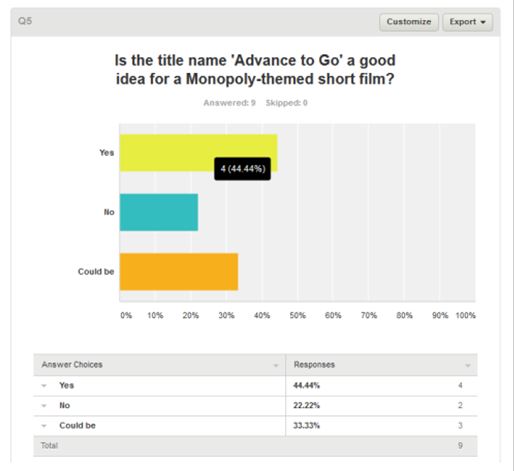
Arguably one of the hardest tasks in the pre-production research and planning was coming up with a suitable title for the film, after a few sessions of discussion we all decided on the title 'Advance To Go'. The influence for this film title was based on the highly successful board game Monopoly. There is a certain square on the board that is significant during gameplay, which is 'Advance To Go'. Another obvious reason we chose Advance To Go is Monopoly's relevance to our short film, our short film follows the story of four young individuals that discover a supernatural board game and the board (prop) used in the sequence is an actual monopoly board as it would have been too challenging to craft our own original board with the time allowed for the examination, also it contributes to the recognition for the audience. Above you can see the first question we asked on online survey service. The results revealed that mass majority believed it was a good choice for a short film title at (44%) and only (22%) of the surveyors believed otherwise. The remaining (33%) were those who were unsure and believed it 'could be' a good choice. All in all the results were predominately positive and so we therefore went ahead with the idea.
Another task we set ourselves in the pre-production research and planning was what aspects we could include that were challenging and unique and therefore produce and original and striking final outcome. One of the aspects was an editing technique called a time-lapse. A time-lapse is a post-production technique for speeding up a situation in order to connote a fast forward effect that makes a certain mundane scene more easy to watch. As you can see from the results above the idea was just popular among our team but turns out to be very popular amongst potential viewers. (77%) of the people who answered the question believe it was good idea, with only (11%) believing it was a negative approach. Again with this information it gave us the reassurance that the risk was worth taking and will prove to be a benefit for the final outcome.
This next section of audience feedback was submitted by Joe Blissett, he managed to receive valuable feedback on the social networking site Face Book, that offers a reliable and informative reflection of our final product. Here are some of the examples:
Here is a very good example of effective balanced criticism. Although we don't necessarily get marked on the quality of acting we do get marked on our ability to delegate and direct efficiently, which I believe we did to the best of our abilities. However it is clear that there are improvements that can be made moving forward and something I would personally take into my next moving image project in the foreseeable future. To address the second point, although we solely used sound recording equipment separate to the camera itself it is evident that this was not made clear enough in some parts of the film. A overhead boom mic would have significantly rose the quality of sound however the equipment that was available was limited and therefore restricting, but it is defiantly another factor to take into account moving forward.

Another important point to take from this section of the feedback is the visibility of the text message when one of the characters receives both a positive and a negative message it is not very clear in the frame from the audiences point of view. A way of preventing this next time an Extreme Close Up (ECU) of the phone allowing the message on the phone to be clearly visible and possibly creating more enigma and excitement as it is more up close and personal for the viewers.
Friday 15 January 2016
Q2 of the Evaluation - By Joe Blissett
This is my Question 2 for the evaluation.
How effective is the combination of our main product and our ancillary tasks?
In this video, I explain how both our ancillary tasks (the LWL review and film poster) target our audiences as well as how the combination of them all, come together to form a brand.
Friday 8 January 2016
Question 3 of the Evaluation - By Joe Blissett
What have you learnt from your audience feedback?
Firstly, we aimed to target our product at a rough demographic of ages between 17-25, and I would mostly say aimed towards males rather than females. This is predominately because of the fact that the genre we tried to create was a thriller type genre, and so males are stereotypically more into these kind of films compared to females... however this does not mean that we only aimed our film towards males, as many females that responded to our audience feedback, liked the idea of our film too.
To make sure our products would appeal to our target audiences we tried to include different conventions of the genre-type so that when the audience would come to watch it, they could recognise the film as being part of a thriller genre. This included using low key lighting in areas that were used to build up tension as well as using a non-diegetic soundtrack to portray the same ideas.
Audience Feedback from social media
During this process, we collated numerous amounts of audience feedback about the early stages of production, including ideas about the title of the film as well as ideas into using editing techniques such as slow motion in important areas to add emphasis. Below is a couple of examples.

Even though this question produced us with reliable and good answers, I still believe we could've possibly asked other questions about different ways of accelarating/decelarating time, as this would give our audience the chance to think about what would work more effectively for our specific film.

We got this data from a popular survey website 'SurveyMonkey', which allowed us to create our own questions using a template from recent surveys. I found this incredibily easy to use and by publishing the link of the survey onto social networking sites, it allowed our target audience to easily comment on our ideas. This helped us a lot as it gave us some initial feedback on what our demographic thought of any basic ideas to start off with and so we could grow our ideas from that!
Below are comments from various friends and family that have watched our short film via a link on a social media post. This is what they had to say..!


All of the comments above are very useful in terms of overall thoughts about the postive and negatives of our film. I especially liked the final comment as he described each element in steps, and so from this we can easily see what needs to be improved as well as what went well.
From this audience feedback, the overall feedback is that some scenes weren't clear enough in portraying what had gone on, as well as there not being enough emphasis on particular shots that portrayed something significant, such as the transferring of money into the character's bank accounts.
In order to improve this, I believe we could re-film certain shots so that the audience would have a better understanding of what had occured, instead of them becoming confused about certain areas. However about from this, I believe that most of the respondants understood the main points from the film, and would be able to explain what had happened in the storyline, which is positive news as that is ultimately what our main aim was.
One of the comments quoted in saying at how the audio didn't seem to be that clear, perhaps hinting at the fact that it was taken directly from the camera, however it was not. It was infact taken from multiple sound recording devices, however when it came to editing, we found that not all of the sound was that clear as well as the fact that the sound was only coming out of one speaker and so we had to adjust this during post production to try to rectify this, but clearly it wasn't as well thought out as planned. To improve this aspect, we should've listened back over each sound recording after we had recorded so that we were all happy with what we had got.
A couple of the comments was to do with the actors being a little 'robotic' which we were aware of at the time, however the people we used in the film we obviously not actors and so to be a part of our film voluntarily was good credit to them!
Overall, however, the main feedback is positive yet constructive, which is useful as we can see how our target audience thought our film went.
Evaluation - Amy Sharp
Q1.In what ways does your media product use, develop or challenge forms and conventions of real media products?
When relating one product to another research is vital in the understanding of the task, looking back at what I learnt from my initial short film research I have found the following conventions are apparent:
In all of the products I analysed they have a simple storyline that isn't complex however, they all include a plot twist or second understanding that catches the audience out. Such as in the short film '30 seconds 2 late' the audience is initially led to believe it has a happy ending but through clever editing the truth is revealed. Which leads me to believe a short film can have a open or closed narrative it isn't a fixed decision, this is because the short film 'Exposed' has an open narrative that has a sinister/disturbing meaning whereas '30 seconds 2 late' is closed and the audience is unaware of the plot twist until it is revealed.
Camera work, sound and mise en scene is specific to the film rather than a convention across all. For example:
Phone Box (mvillasenor 2013)
Virgin media shortsPhone Box (mvillasenor 2013)
'A man is threatened and must complete a task to save his daughter'

 A foley of a phone ringing begins the short film. The camera focuses of a males feet running, accompanied by an intense soundtrack. The camera cuts quickly focusing on his legs and torso before cutting to a long shot of his whole body running down a street, this builds tension and is a common technique used to show someone either being chased or running in an intense situation. As the character runs towards the camera we see the distress in his facial expression before he runs to the telephone box the camera shows 3 shots when he goes to the phone. The first is from side on and shows him opening the door which quickly cuts to the second shot which is a high angled shot in the box to show him grabbing the phone rather than calmly picking it up and finally to the last shot which is a close up outside of the box focused on his face to show his reaction to the conversation. In three simple shots the director is able to show intensity in each action highlighting how every dramatic action is important to the characters emotions. The conversation in the telephone box informs the audience that if he keeps being late ‘your Aiko will start losing fingers’ the camera is face on in a close up so the facial expression of fear is shown clearly on his face. The camera follows each action the character makes so it places us in the scene and puts the audience in the prospectus of the male using pov shots and close ups to convey emotion.
The familiar man from before walks across in a medium close up before being called over by a white male who is smartly dressed in a suit, presumably an employee. Interestingly he speaks English but with an accent which is contrasting with the foreign language exchanged before. The main character is given a parcel and as before 3 shots are shown: each a close up of the male dramatically opening the package building tension. A close up reveals what is inside, it is a plushy toy which we can assume from the opening it belongs to Aiko. A foley of a phone ringing sounds as we see the toy followed by the voice from the telephone box. In a close up we once again see the facial expression of the character this shows how he has a close connection to Aiko and the toy is key to her personality/character. A quick cut to an extreme close up of the phone holder appears on screen. At this point we can assume we are back to present day as the character is out of breath and the conversation carries on from before. A low angled medium close up shows the character take out an object from underneath the telephone. It changes to a high angled shot in order to show a better view of the object which we can assume from the context and shape it is a gun, this is a semantic code in a thriller genre and also an action genre. As he looks over to see the man the antagonist describes the camera moves over too showing through the telephone box a male character, all the voice says about him is ‘you know what you have to do’.
Faded shots begin showing either the future or what he imagines it is unclear, the voice over of the antagonist plays through as the camera cross cuts between the character in the telephone box and in the faded shots where we assume he is going to kill the man. We see shots of everything that has happened including him raising the gun before it all merges into one building tension. It is suddenly cut off by returning to an extreme close up of the phone holder, as the phone is put down dramatically the sound is replaced by a foley of a gunshot. So the audience can only assume he killed the man. The scene changes to a street where the character walks into shot on the phone. It is a females voice and the medium close up shows his confusion and distress, she then says ‘Aiko, daddys on the phone’ which shocks both him and the audience as it reveals she is safe and in no danger at all. He asks where her toy is and in reply the woman, presumably his wife, says ‘right here. She never lets it go’ the character stops walking straight away and the camera moves back showing the toy in his hand and his shocked facial expression. He drops it and the camera cuts to a close up of it on the ground as police sirens sound in the background.
This short film showed me how camera techniques can change the atmosphere of a scene as well as sound. Using close ups can draw attention to certain areas in the shot, giving clear information to the audience. We used this technique to draw attention to certain aspects in our film, as well as using sound to build tension when needed in order to hint towards a sinister occurrence in the film. From researching one short film we learnt a lot of key conventions in terms of mise en scene, camera work and sound these being how to build tension in a short amount of time (especially for thrillers) and how to use sound and mise en scene to convey hidden meanings.
Characterisation is something we had to think about in terms of quantity, age and gender. As we wanted our film to be realistic we aimed to find a group of 4 that knew each other comfortably enough to look natural when playing and conversing during the film. We decided to have 2 couples to even out genders and make the likelihood of them meeting and playing a game more realistic. The aim was to have them aged 18 to be within the target audience of 18-25 year olds which is common in all films not just short films, the main characters are relatable to the target audience.
Characterisation is something we had to think about in terms of quantity, age and gender. As we wanted our film to be realistic we aimed to find a group of 4 that knew each other comfortably enough to look natural when playing and conversing during the film. We decided to have 2 couples to even out genders and make the likelihood of them meeting and playing a game more realistic. The aim was to have them aged 18 to be within the target audience of 18-25 year olds which is common in all films not just short films, the main characters are relatable to the target audience.
In our short film we followed the conventions that match our chosen genre (thriller) to successfully create the short film.
nine frame analysis:
 Our short film begins with a extreme close up of a mobile phone falling to the ground (in slowmotion) as our title flickers on screen in sync with the foley of a disrupted phone call. Beginning a circular narrative to grab the audiences attention, the title is placed clearly in the center and flickers to show the disruption of the scene.

The shot is cuts to a close up of wine glasses being filled to capture the audiences attention further as it is so abrupt. The setting is clearly different to the opening shot implying to the audience they are watching a different time to the one before, the use of low key lighting in the opening shot contrasts with the high key lighting shown in this shot further suggesting the change in time and place. The shot clearly shows 4 wine glasses hinting to a group from the beginning.


The shot is cuts to a close up of wine glasses being filled to capture the audiences attention further as it is so abrupt. The setting is clearly different to the opening shot implying to the audience they are watching a different time to the one before, the use of low key lighting in the opening shot contrasts with the high key lighting shown in this shot further suggesting the change in time and place. The shot clearly shows 4 wine glasses hinting to a group from the beginning.


 A medium shot places and introduces the first 2 characters of the short film, they exchange dialogue before a shot reverse shot sequence to keep the recording smooth and the editing less jumpy between shots. The wine glasses are kept as they were in the shot before for continuity and due to the smart/casual costume choices it further suggests they are/have company.
 The four shots to the right are examples from the shot reverse shot sequence, the purpose of this is to show the dialogue being exchanged between the two characters as well as seeing their facial expressions throughout. The dialogue of this scene is important because it confirms they have guests and that they want to play a board game which is the key part of our film therefore, a shot reverse shot sequence is appropriate.


Above is a match on action that shows the audience the male character finding the boardgame, the match on action gives the content a more interesting view point rather than it being from behind the whole duration. It is a strong opening sequence and stays natural which is what we intended, the shots used at the beginning are easy to follow so keep the audiences attention but are well thought out and creative. Along with our short film we created a poster and review to have a small marketing campaign like those in the real media.
Our film posters purpose is to compliment and represent our film, looking at other posters early on in the portfolio allowed us to see how different layouts work and can change the atmosphere of a poster.
A Church of Cards
Conventions:

Conventions:
- The text of the title is larger than all other text.
- main image - kept away from majority of the text.
- The secondary image reveals the plot/setting/scenario of/in the short film.
- block of credits.
Narrative:
It is clearly shown in the poster a competition related to poker or another casino game is the basic plot of the film, this is due to the set up in the lower half of the main image. The use of separating the image into individual sections for each actor with varying facial expressions portrays the idea of a competition. They are not placed together taking away the possibility of a team, along with the facial expressions showing that characters persona. The title 'A Church of Cards' is only initially significant through the word 'cards' due to the assumed casino setting, the idea of a 'Church' is religious therefore could be a possible hint to that being a part of the narrative although through the poster that is not confirmed.
Representation:
Each character has their own representation through being sectioned on the poster. None of the characters look at the camera but at each other showing the competition and suspicion that is shown in these types of games. All four men are in suits showing a formal theme, the woman looks to be smartly dressed but not in a seductive matter, which is less common in casino based films, showing her almost as an equal to the male characters - she is just as serious.
Genre:
The genre isn't specifically clear in the poster, however it has aspects of a thriller through the dark background and separation.
Audience:
From the age of the characters - 40 to 50 years old - the target audience would be around that age or just younger 35-50years old. This is also due to the narrative of the short film, the poker seen would be more familiar with this age group.
Media Language:
In this film poster nothing is revealed to an extent, we are given little to process in terms of the films narrative/intentions. The camera work and editing of the poster is used to create a divide between the characters, each having their own frame and own personality showing off their differences. The only link made is the eye contact, even though there is no eye line match between the characters it is clear they are all aware of one another through the way they have been placed: the two males at either end are looking inward towards the other characters, and the other three are looking in different directions - each character has someone looking at them. The editing shown with the poker set up bring the context into the facial expressions along with the title 'A church of Cards' the link is clear. The lighting is low key however each character has a spotlight to highlight their facial expressions, the black background with white text contrasts and emphasises not only the title but the framing also. The title itself becomes almost unrelated, there is no obvious reason for the typography, along with what I mentioned earlier about the meaning of the title. Wild Tales

- Main images - sectioned, telling a story?
- Block of credits
- Critics reviews
Media Language:
The layout of this poster is different from most you see, this may be due to it being a foreign independant film however it also may be due to its possible meaning. The 6 sections could show a story/journey, they are clearly clips from the film and due to each section having a different actor/s it is highly likely that they are separate stories. Dispite the emotions in facial expressions the poster remains bright and cheerful, the white background brings out the light in the images and highlights the impact of the black text.
Narrative:
As said above, the main image/s show various characters in vastly different settings suggesting the narrative is one based on various different stories that overall connect to a singular one. The title 'Wild Tales' also suggests this, various 'wild' stories and complete one 'tale'. From looking at the images the bottom photo is clearly a wedding due to mise en scene, primarily costume, and is the largest photo suggesting it is the main story line. The others however aren't so clear giving the audience mystery the only hints are the setting in the backgrounds, facial expressions and one quote from a review in bold "apocalyptic revenge".
Genre:
By looking at the critics reviews:
-"tales of apocalyptic revenge. The years most fearlessly funny film"
-"Hilarious! Outrageous!"
From these it is clear the film is a comedy but otherwise looking at the pictures it isn't as clear, with the image alone it seems to be a romance or action based film. This could be correct however from the poster it is not clear.
Audience:
The target audience for this film would be broad, however I think it is most popular with 18-25year olds due to the narrative and age range of the actors. It is also a foreign film therefore it is less likely a younger audience would be appealed by this film. It is technically rated a 15 however I don't think this film would appeal to this age.
Representation:
There is no negative representation shown in this poster, its purpose is to show the varying story lines.
Comparing the two poster analysis' above they have similar layouts in the form of separating the poster into various sections, both successful but both conveying different meanings. This taught me the importance of colour, size and material but also the importance of using dead space. Below is my initial poster:
Poster Comparisons and development
Poster Comparisons and development


Similarities between our poster and a real productions:


Review:
What is Little White Lies and Who Reads It?

What is Little White Lies (LWL)?
Published by a London-based creative agency - The Church of London - LWL is a Bi-monthly British independent movie magazine. Each issue of the magazine, which has been running since 2005, is inspired by one main feature film which is displayed on the cover represented by an illustration of its lead actor. The content is split into six chapters: the lead review, an editorial introduction, a series of articles inspired by the feature film, theatrical reviews, the back section and the future releases.
LWL is distributed throughout the UK and is stocked in shops including: WHSmith, HMV, Urban Outfitters and Fopp along with some independent cinemas. In 2010/11 they introduced and launched a LWL app which has three main components: to keep up to date with the latest thoughts and opinions from their blog, a complete archive of all reviews and a 'now showing' button which shows the nearest independent cinemas in the area and what they are currently showing.Who Reads It?
LWL conducted a reader survey in late 2008 even though this isn't recent it gives a rough understanding of the target audience:
- The majority (51%) of the 250 UK readers are aged 25-35 and 63% were male.
- 50% earn 0-20k, and 42% earn 20-40k.
- 22% work in Media and 20% in Creative.
- 72% visit the cinema 0-4 time per month.
- 32% share the magazine with 1 other person and 49% share with 2-3 people.
- 62% buy 0-4 DVDs a month.
- 54% play video games regularly.
- 93% read almost all of each issue.
- 93% keep their copies.
What are the Layout Conventions?
Layout Conventions:
The style of Little White Lies is referred to as a 'house style'. The main image, taken from the film, takes up the top 3rd of the page in colour and is always rectangular. Followed by title - centered underneath, in the font 'Century Gothic' - it is the largest font on the page as well as in a different colour to further show its importance.
Underneath this is the films information: The names of the director, the starring actors/actresses and the release date. These are in the font 'Aparajita' and the information is in italics and lowercase whilst the names and date are in bold and uppercase - all centered below the title.
For the review itself is all in the font 'Aparajita'. It begins with a 'drop capital' and every review has 5-6 indented paragraphs, the text is in the 'justify' format (meaning all the text is equally spaced and centered). All film titles are in italics and most actors are names in brackets, the writers name is in bold and upper case at the end of the review.
The 'tripartile ranking' system is their way of finalising the film, the 3 categories: anticipation, enjoyment and in retrospect are marked out of 5 and are accompanied by explanatory text on each review. In the layout it is underneath the end of the review and is kept in line with everything else so the review overall is uniform. The font continues on from the review: the titles in uppercase and underlined with the comments lowercase, however the numbers are in century gothic where they are bolder.
The last note on the layout is the 'Review' on the left margin in the font 'microsoft yahei' to note the section and clearly state the page is a review. Along with the page number, in 3 digits centered at the bottom.
Dimensions:
Width: 196mm
Length: 245mm
Each column of text is 52.4mm wide (flexible) and 107mm long.
Total text review width is 168mm x margin either side. Length is 217mm + margins top and bottom.
The image is 70mm x 168mm (flexible).
Observations from reading Little White Lies
Due to the ancillary task being to write a review in the format and style of the reviews published in Little White Lies, I found it necessary to take the time to read previous reviews. The style of writing is personal and informal; the writers tend to ask a variety of rhetorical questions in their reviews in order to get the audience thinking as well as sharing their honest opinion. This will be hard to achieve as we have to look at our own film- that we ourselves have produced - from an outsiders angle.
Some reviews take small parts of the film to talk about in detail on whether they have or haven't worked out whereas some are more factual about the narrative, I assume this depends on the films genre/narrative along with the writer themselves, but either way it is giving me a clearer view on how to approach this task. Others have comedic touches, and hints of sarcasm mimicking the movies aura; in a review for the film 'Submarine' the writer says "...sometimes pretends to have Cotard's syndrome: a type of autism, hes dictionary tells him, that convinces people they are dead" it is factual information about the film but the added in detail makes reference to the film as well as making it informal.
What appears in all of the reviews are the use of brackets when referencing films and actors as well as italics for film titles. As we know all the reviews have the same layout of appearance but from reading individual ones it is clear to see they each add their own characteristics therefore, when writing my own review I aim to be personal with my writing and make it my own.
Reading Little White Lies has helped me further understand the style they produce and what I need to aim for when it comes to writing my own.


Question 2:
Question 3: What have you learnt from your audience feedback?
 Our target audience ranges between the ages of 17-25 we are more familiar with the needs/interests of this audience due to being a part of it. Having strong knowledge allowed us to make certain decisions with ease, but also we could reach out to people in our audience with no problems. In my opinion our film is aimed at both genders, this is because both enjoy thriller films and none of our marketing is stereotyped toward one gender.
Our audience feedback helped to guide our decisions throughout the process. We created a survey on the website 'survey monkey' from this we gathered information from our target audience in the early stages of our research and planning in pre production.
 |
| Answer: Yes |
 |
| Answer: Agree |
 |
| Answer: Yes |
Eventhough the outcome isn't 'strongly agree' we feel the audience still has a positive response to this question and have some doubts therefore we kept wary of it and researched it further to make sure we could have a strong impact on our audience.
There wasn't any disagree/strongly disagree therefore the audience may have struggled with understanding the question or felt wary with their answers but it is a good response overall.
This was an important question for our research as it was the titled we favoured overall, from the audience feedback here we can see it is to the majority yes. Even though we had some no's and a selection of people were unsure we felt it was still a positive outcome and decided it was a good name for our monopoly themed short film.
We gathered further audience feedback once the film was complete:


1. as said above we would re film this and improve on how natural the setting and reactions are.
2. audio was a problem for us, we used an external microphone to record the dialogue but when it came to editing it wasn't clear enough as we didn't pay enough attention to it and didn't have enough experience with it to use effectively. To improve on this we would practice with the external mics and make sure sound is checked throughout the recording process.

3. Another strong response to the timelapse sequences.
4. We thought about doing this idea however didn't prioritise it in our post production editing therefore to improve we would take the time to do this and make it more interesting for the target audience.
Overall we are happy with our film, and see improvement can be achieved. The audience feedback we received took an impact in our thinking and decision making especially in the pre production stages.
Question 4:
Subscribe to:
Posts (Atom)