 It's the place you go if your own island isn’t big enough. It's the
place you go to disappear. Semu Fatutoa was once a highly ranked Samoan
Chief. Technically, he still is; the tattoos shrouding his legs are
immutable proof of the pain he endured to earn his title. But those
tattoos cost him something else: His daughter, nine year old Aveolela,
drowned in the ocean on the day Semu received the tattoos. Weakened by
the gruelling ceremony, he lacked the strength to swim out to save her.
No one blamed him for her death, but Semu blamed the tattoos. Rather
than assume his chiefly duties, he fled. Two years later and thousands
of miles from home, Semu is the only cab driver in Honolulu with the
rank of Chief. He ferries tourists and Japanese businessmen to and from
the airport. He drives in circles, keeps his legs covered, and slowly
forgets his old life. But his old life wants him back. First, there is
the mysterious Samoan staking out his apartment in Waikiki, calling him
on the phone, following him home from the beach. Then there are the news
reports: An earthquake on the Big Island threatens to unleash a tsunami
on the city of Honolulu; anyone with any sense is heading for higher
ground. Probably the Chief would go, too, except for the eight year-old
Hawaiian girl wandering the city in her bathing suit. She has crossed
his path twice today, and both times he let her go. But now the girl's
intrusion into his sequestered life begins to feel to Semu like a
message. A calling. Any minute now, these streets will be silenced by a
wall of water. Semu begins to realise that it's high time he started
living up to his title.
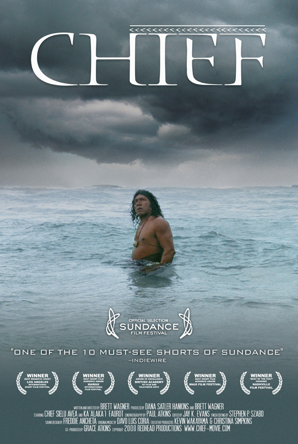
Through elements of media language we get the impression that the theme has a native and primitive atmosphere and is evidently not stereotypically based in an urban environment. This is supported further with the main protagonist placed waist hight in an ocean, he is wearing a native costume, revealing a bare torso allowing his necklace to be shown, this further supports the primitive and native atmosphere constructed by the poster. From researching other similar short film posters there appears to be a pattern in the use of at least two different photographs converging to form one. For example 'Brighton Rock' displays two possibly three contrasting photos merged to make a striking final image. The 'Chief' poster appears to have applied only one photo, which in turn constructs a stronger sense of reality and eliminates the hyper-real aspect that many other film posters seem to convey. From analysing the synopsis and the text, 'Chief' represents the male demographic, as the primary character is a male and appears to be the soul of the short film, this is demonstrated through the text in the poster and the synopsis. The unusual and unorthodox plot to the story places the sequence in an independent, drama genre which is not uncommon amongst short film sequences as the are known for deferring away from iconic Hollywood film narratives. From the evidence provided above 'Chief's' target audience is aimed at the elder adult band, 20-40 years of age and predominately male.
The title in this text is a typical example of symmetrical alignment. We can see two equal opposing gaps between the page margin and the text, giving a sharp and professional feel for the viewer. the font size is far from abnormal, however it is larger than most of the posters I have researched. The font type is unusual and has a significant influence on the over all impression of the text, implicating, again, a native and uncivilised culture, its sharp serif sans font connotes an old, outmoded atmosphere to the audience.
No comments:
Post a Comment